Black & White — The Boldest Neutral Palette in Design
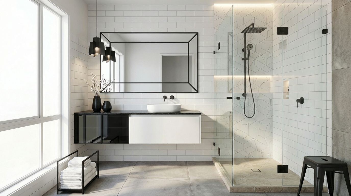
Maximum contrast, zero color — the black and white scheme is simultaneously the simplest and most dramatic palette you can use. Getting the proportions right is everything.
What is Black & White Color Scheme for Interiors?
Maximum contrast, zero color — the black and white scheme is simultaneously the simplest and most dramatic palette you can use. Getting the proportions right is everything.
1/4
See the Transformation
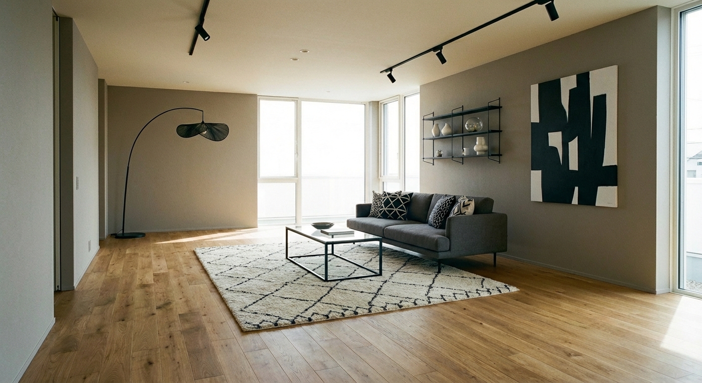

Upload your room photo in the app to see your real transformation
Color Palette
Click any color to copy hex code
Why It Works
Black and white is the highest-contrast palette possible, and contrast is what makes design legible and dramatic. The combination works in every era and style — from Art Deco to minimalist, from Hollywood Regency to Scandinavian. The graphic quality of black and white creates rooms that photograph beautifully and feel intentional. Psychologically, the palette communicates clarity and confidence. The key is proportion: a room with 80% white and 20% black feels open and modern; a room with 50/50 feels bold and dramatic; and a room with 70% black and 30% white feels moody and enveloping. Texture becomes critical in a colorless palette — the eye relies on material variation to create interest and warmth.
Best for
- people ready to test options on a real photo before buying
- anyone planning a real living room where conversation distance, TV glare, and traffic past the sofa matter more than Pinterest perfection
- projects already thinking about sofa, marble, linen and needing a coherent layout
Skip if
- you will not address conversation distance and only want a filter look
- you need the room finished tomorrow with zero test fits
Common mistakes
In a living room, “black” fails when you shopping object-by-object with no envelope decision. Details like sofa, marble, linen only work if the plan respects conversation distance, TV glare, and traffic past the sofa. Another miss: pushing every seat against the walls and calling the empty middle “open”.
Decide this first
fix the primary seating pair and one clear path before decorative chairs. Lock a coherent material story instead of random catalog picks as a short list, then use Intero on a real photo so scale and light are honest before you spend.
How to Achieve This Look
- 1
Start with white walls as the dominant base
- 2
Introduce black through furniture frames, light fixtures, and hardware
- 3
Add graphic black-and-white patterns in rugs, art, or pillows
- 4
Use varying shades of gray to create depth between the extremes
- 5
Incorporate natural wood or a single warm material for relief
- 6
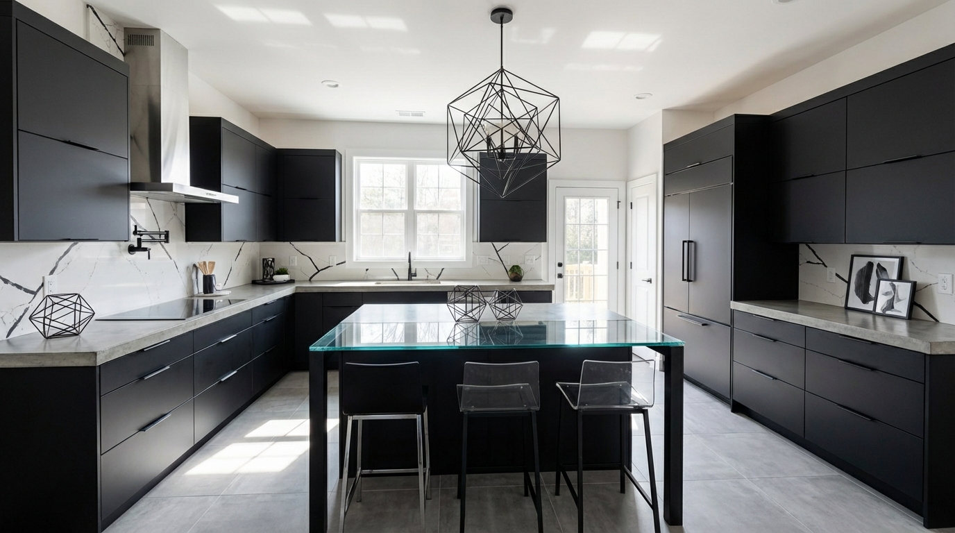
Choose matte black fixtures in kitchen and bathroom for a polished look
Layout & materials
Decide your proportion first. For most rooms, start with white-dominant: white walls, ceiling, and large furniture, with black in statement pieces, hardware, and accents. A black-framed mirror, black light fixtures, black-and-white photography, and dark-legged furniture create the graphic contrast. To add warmth, introduce texture aggressively: a white boucle sofa, a black marble coffee table, a white linen curtain, matte black ceramics. Natural materials like light wood, woven rattan, or tan leather can serve as the bridge between black and white, preventing sterility. For a bolder approach, try a black accent wall or black kitchen cabinetry against white walls and countertops.
Break up a strict black and white scheme with one natural wood piece — it adds warmth without disrupting the palette.
Black and white proportions are critical — too much black makes a room feel dark, too much white feels clinical. Intero AI lets you test different ratios in your specific room and lighting conditions. See how a black accent wall, black furniture, or black hardware would look before making permanent decisions.
Frequently Asked Questions
Q1 How do I make a black and white room feel warm?
Add natural materials as a third element: warm wood, rattan, woven jute, tan leather, or linen. These bridge the stark contrast and add organic warmth. Warm lighting (2700K) is also essential — cool lighting makes black and white rooms feel severe.
Q2 Does black and white work in every room?
Yes, with adjusted proportions. Bathrooms and kitchens are natural fits (think black and white tile). Living rooms and bedrooms work best with a white-dominant ratio and plenty of texture. Dining rooms can handle more black for drama.
Q3 Should I use true black and true white?
Not necessarily. Softened versions — charcoal instead of jet black, cream instead of stark white — are easier to live with and feel more sophisticated. True black-and-white contrast works best as an accent (a framed print, a tile pattern) rather than the entire room.
Related searches
These are the next pages people usually open while narrowing this design direction.
Ready to See This Style in Your Room?
Download Intero and preview this design on your own room photo.
No credit card. No signup. Just results.
Scan to download
Point your phone camera at a code

