Blush & Cream — Soft Elegance for Every Room
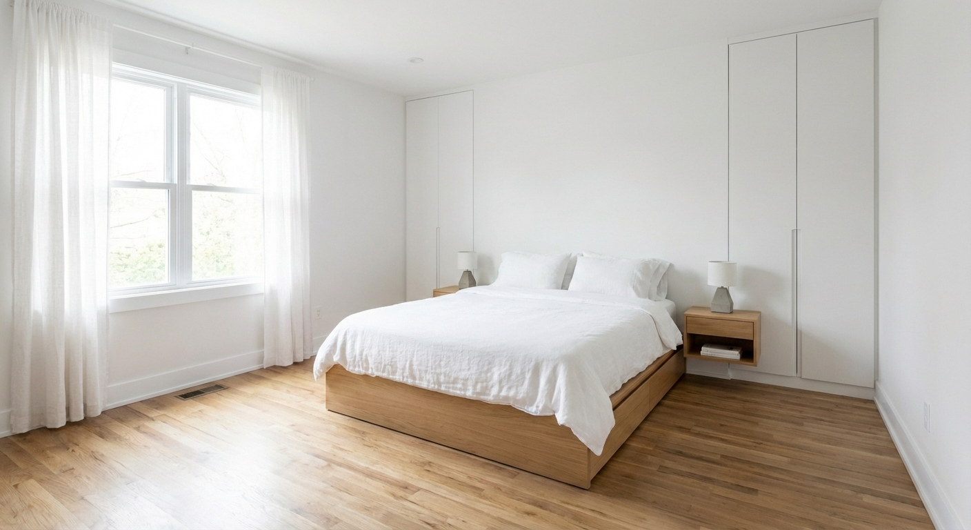
Blush is not just for nurseries. Paired with cream, it creates a subtle, sophisticated warmth that elevates bedrooms, living rooms, and bathrooms with quiet elegance.
What is Blush & Cream Color Palette for Interiors?
Blush is not just for nurseries. Paired with cream, it creates a subtle, sophisticated warmth that elevates bedrooms, living rooms, and bathrooms with quiet elegance.
1/4
See the Transformation
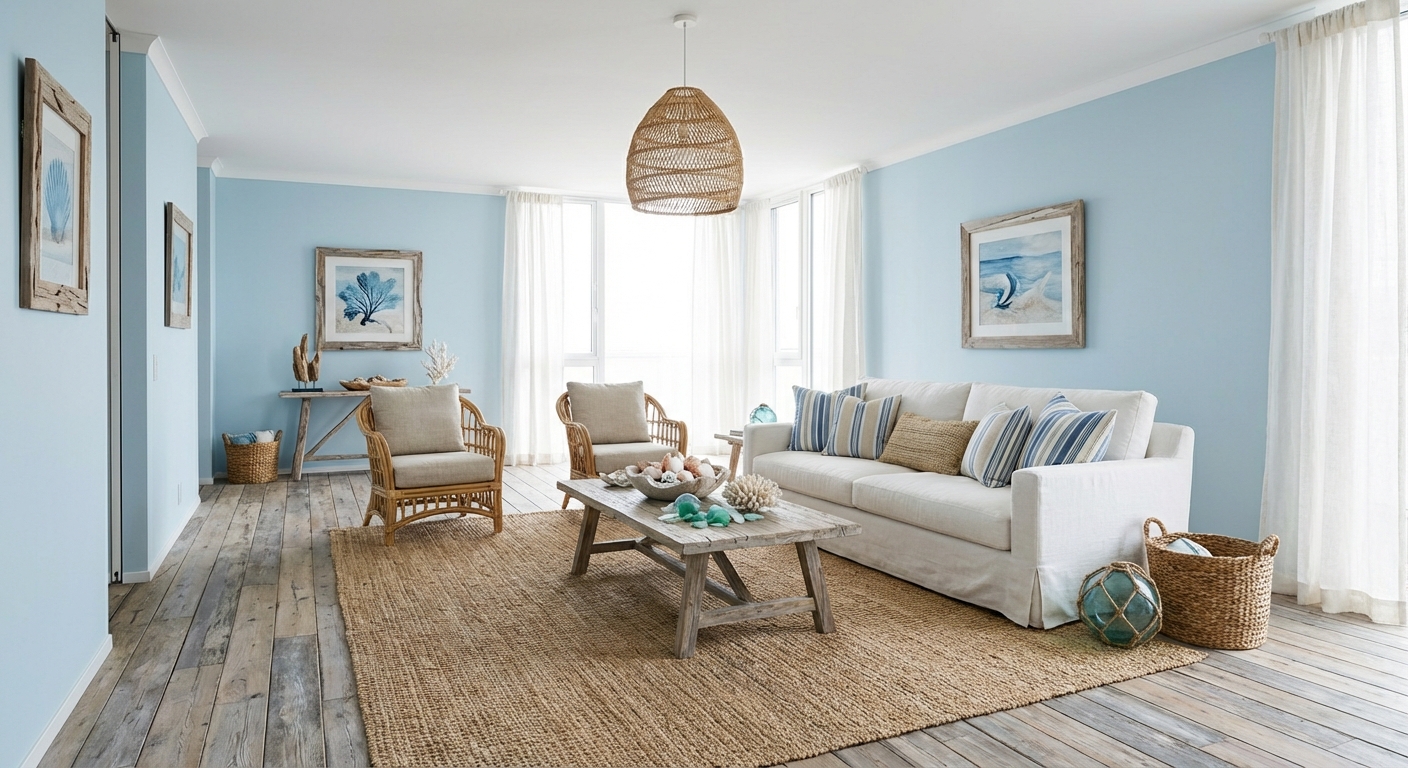

Upload your room photo in the app to see your real transformation
Color Palette
Click any color to copy hex code
Why It Works
Blush — a muted, dusty pink with beige or gray undertones — functions as a warm neutral rather than a bold color. When paired with cream, it creates a palette that feels luminous, gentle, and sophisticated. The combination works because both colors are warm and light, creating an effect of soft, diffused warmth similar to golden-hour sunlight. Blush adds just enough color to prevent a cream-only room from feeling bland, while cream provides enough neutrality to keep blush from feeling too sweet. This palette excels in bedrooms where the soft tones promote relaxation, and in living spaces where it creates an inviting atmosphere that flatters skin tones in both natural and artificial light.
Best for
- people ready to test options on a real photo before buying
- anyone planning a real living room where conversation distance, TV glare, and traffic past the sofa matter more than Pinterest perfection
- projects already thinking about rug, curtains, linen and needing a coherent layout
Skip if
- you will not address conversation distance and only want a filter look
- you need the room finished tomorrow with zero test fits
Common mistakes
The usual blush living room miss is shopping object-by-object with no envelope decision. Details like rug, curtains, linen only work if the plan respects conversation distance, TV glare, and traffic past the sofa. Another miss: pushing every seat against the walls and calling the empty middle “open”.
Decide this first
fix the primary seating pair and one clear path before decorative chairs. Lock a coherent material story instead of random catalog picks as a short list, then use Intero on a real photo so scale and light are honest before you spend.
How to Achieve This Look
- 1
Paint walls a warm cream or soft ivory as the foundation
- 2
Introduce blush through one upholstered piece or set of cushions
- 3
Layer cream, ivory, and blush textiles in varying textures
- 4
Add gold or rose gold hardware and light fixtures
- 5
Use white marble or light stone surfaces for a polished feel
- 6
Keep wood tones light and warm — white oak or bleached pine
Layout & materials
Keep cream as the dominant color: walls, large furniture, and the rug should stay in the warm white-to-cream range. Introduce blush through medium-sized elements: an upholstered headboard, a set of curtains, accent pillows, or a single accent wall. Add depth with tertiary tones: warm gray for grounding, gold or brass for warmth, and soft charcoal for contrast. Materials should be soft and luxurious: velvet in blush, linen in cream, marble with pink veining, and matte gold fixtures. Avoid using both colors in their lightest form everywhere — the palette needs tonal variation to prevent washing out.
Use blush as an accent, not the dominant color — too much pink reads juvenile. Let cream carry the room and blush punctuate it.
Blush can easily tip into bubblegum pink or read as too juvenile if the wrong shade is chosen. Intero AI lets you test different blush tones — from barely-there rose to deeper dusty pink — in your actual room to find the shade that reads as elegant rather than sweet.
Frequently Asked Questions
Q1 Can blush and cream work outside of bedrooms?
Absolutely. Blush and cream create a sophisticated palette for living rooms (a blush velvet sofa against cream walls), bathrooms (blush tile or vanity with brass fixtures), and dining rooms (blush upholstered chairs). The key is using muted, grayed-down blush rather than bright pink.
Q2 How do I use blush without making a room look feminine?
Pair blush with grounding elements: charcoal accents, black metal hardware, natural wood, and concrete or stone surfaces. Choose a blush with gray or beige undertones rather than pure pink. When balanced with darker, weightier materials, blush reads as warm neutral rather than feminine.
Q3 What metals pair best with blush and cream?
Gold and brass are the natural companions — their warmth harmonizes with the warm pink undertones. Rose gold also works well. Avoid silver or chrome, which create a cool contrast that can make blush look flat.
Related searches
These are the next pages people usually open while narrowing this design direction.
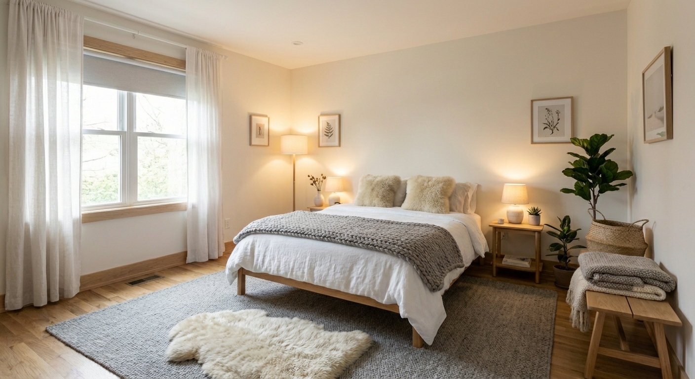
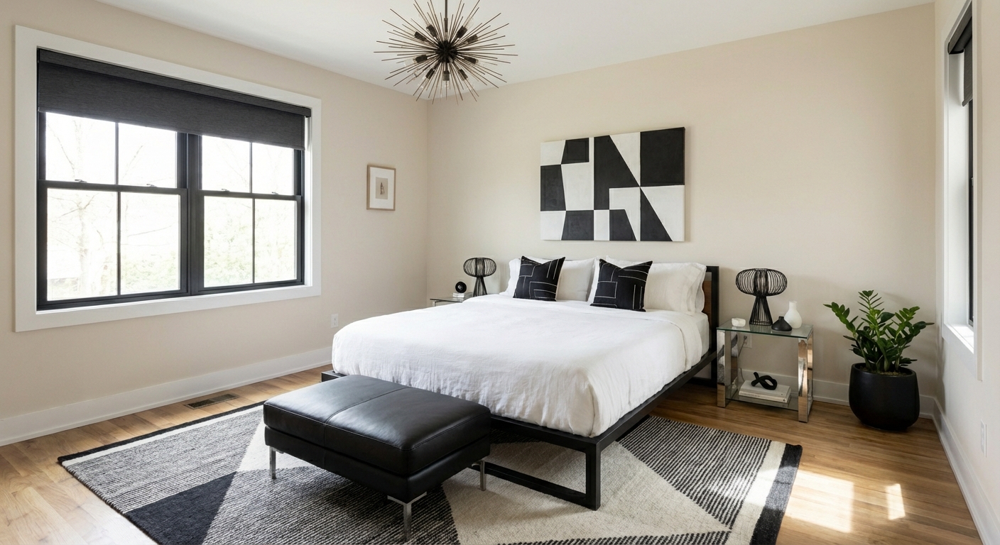
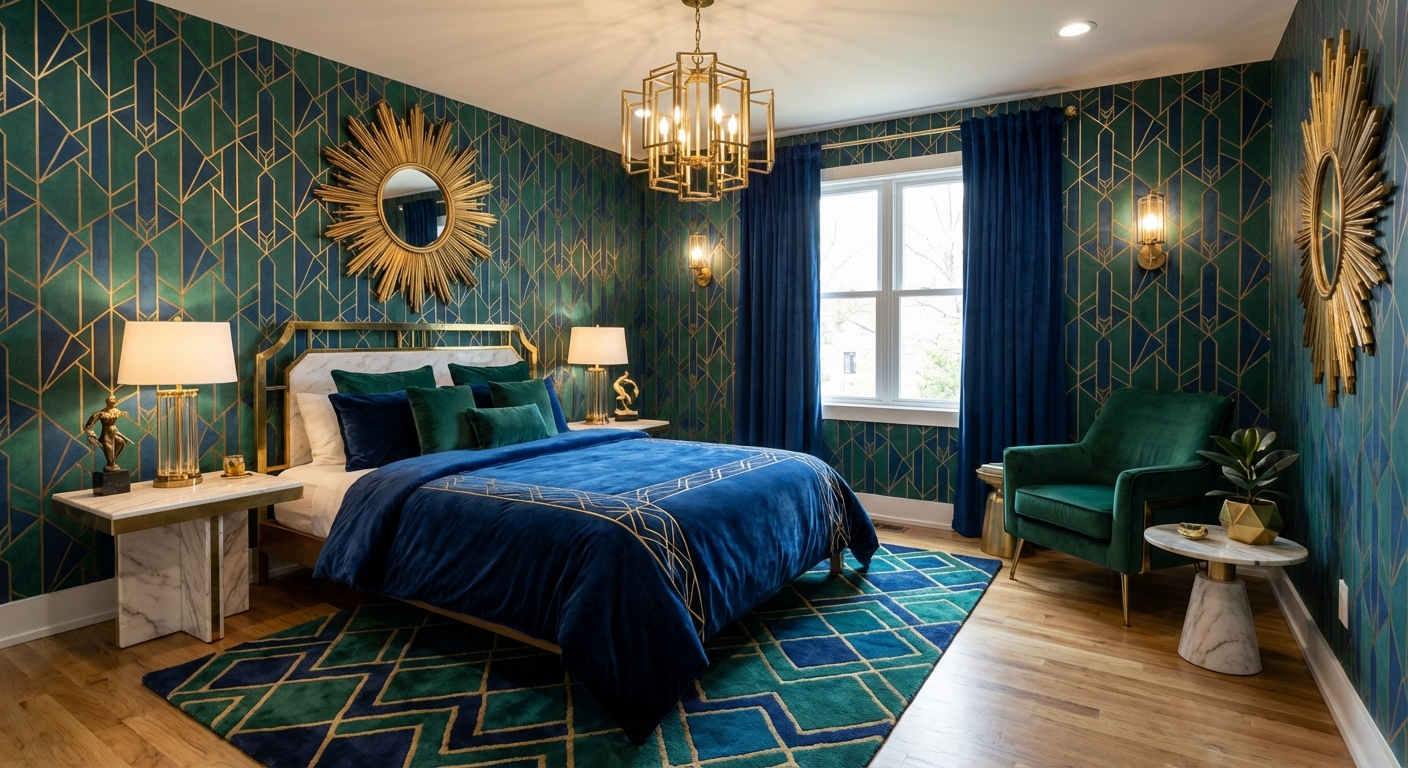
Ready to See This Style in Your Room?
Download Intero and preview this design on your own room photo.
No credit card. No signup. Just results.
Scan to download
Point your phone camera at a code

