The Cool Gray Palette for Sleek, Sophisticated Spaces
Cool grays deliver instant sophistication. From pale silver to deep charcoal, this monochromatic palette creates rooms that feel polished, calm, and effortlessly modern.
What is Cool Gray Color Palette for Interiors?
Cool grays deliver instant sophistication. From pale silver to deep charcoal, this monochromatic palette creates rooms that feel polished, calm, and effortlessly modern.
1/4
See the Transformation
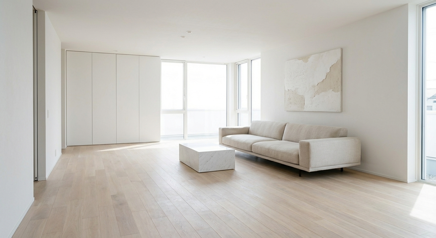

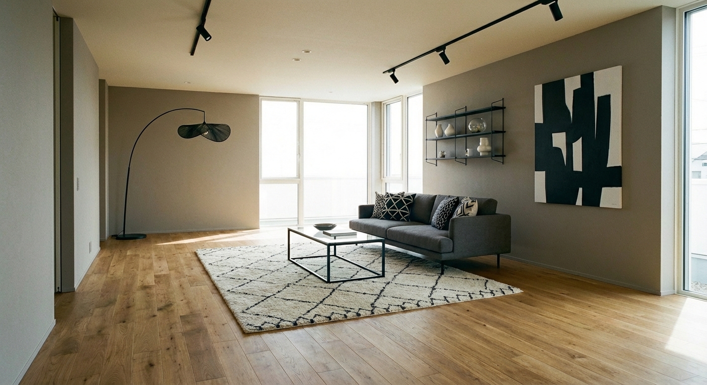
Upload your room photo in the app to see your real transformation
Color Palette
Click any color to copy hex code
Why It Works
Cool grays work because they sit at the intersection of neutrality and sophistication. Unlike warm neutrals that feel cozy, cool grays feel crisp and contemporary — like the visual equivalent of a tailored suit. The palette creates depth through value contrast: light grays on walls recede to create space, mid-grays on furniture provide substance, and dark charcoals ground the room with visual weight. Using the 60-30-10 rule: 60% light gray on walls and ceiling, 30% mid-gray on furniture and textiles, and 10% deep charcoal or black in accents and hardware. Cool grays also make colors pop — a single mustard cushion or teal vase becomes a statement piece against a gray backdrop.
Best for
- people ready to test options on a real photo before buying
- anyone planning a real living room where conversation distance, TV glare, and traffic past the sofa matter more than Pinterest perfection
- projects already thinking about paint, sofa, linen and needing a coherent layout
Skip if
- you will not address conversation distance and only want a filter look
- you need the room finished tomorrow with zero test fits
Common mistakes
The usual cool living room miss is shopping object-by-object with no envelope decision. Details like paint, sofa, linen only work if the plan respects conversation distance, TV glare, and traffic past the sofa. Another miss: pushing every seat against the walls and calling the empty middle “open”.
Decide this first
fix the primary seating pair and one clear path before decorative chairs. Lock a coherent material story instead of random catalog picks as a short list, then use Intero on a real photo so scale and light are honest before you spend.
How to Achieve This Look
- 1
Select a cool gray with blue or green undertones for walls
- 2
Use crisp white for trim, ceiling, and architectural details
- 3
Layer multiple gray tones from pale silver to charcoal
- 4
Choose chrome or brushed nickel hardware for a cohesive look
- 5
Add one warm element — wood, leather, or greenery — for contrast
- 6
Use white marble or light stone surfaces to enhance the cool palette
Layout & materials
Start with a light cool gray on walls — look for paint with blue or green undertones. Pair with a mid-gray sofa in a textured fabric like boucle or linen to add visual interest. Ground the room with a darker charcoal rug or dark-stained wood floor. Mix metal finishes in silver, chrome, or brushed nickel to complement the cool tones. Add white as a brightening agent — white trim, white shelving, white ceramics — to prevent the palette from feeling heavy. Introduce one warm element to break the coolness: a tan leather accent chair, a wooden side table, or a warm brass lamp.
Pair cool grays with one warm material — a honey oak shelf or cognac leather — to keep the room from feeling sterile.
Gray is notoriously tricky — it can read blue, green, or purple depending on lighting and surrounding colors. Intero AI shows you exactly how different gray tones will look in your room with your specific light, eliminating the most common gray-paint mistake: choosing a shade that looks perfect on a chip but wrong on the wall.
Frequently Asked Questions
Q1 How do I prevent a gray room from feeling cold?
Add warm materials: natural wood, leather, or brass accents. Use warm-toned textiles like cream or camel alongside the grays. Warm lighting (2700K-3000K bulbs) is essential — cool lighting in a gray room amplifies the coldness dramatically.
Q2 What is the best gray paint color?
It depends on your light direction. North-facing rooms benefit from warmer grays (Benjamin Moore Revere Pewter). South-facing rooms can handle cooler grays (Sherwin-Williams Repose Gray). Always test three to four samples on your wall before committing.
Q3 Does gray go with wood tones?
Yes, but choose the right wood. Cool grays pair best with light or medium-toned woods: white oak, ash, and birch. Warm reddish woods like cherry can clash with blue-based grays. If you have warm wood floors, choose a greige (gray-beige) instead of a pure cool gray.
Related searches
These are the next pages people usually open while narrowing this design direction.
Ready to See This Style in Your Room?
Download Intero and preview this design on your own room photo.
No credit card. No signup. Just results.
Scan to download
Point your phone camera at a code

