Coral & Navy — Warm Energy Meets Deep Sophistication
Coral radiates cheerful warmth. Navy provides dignified depth. Together, they create a high-contrast palette that is bold without being loud.
What is Coral & Navy Color Scheme for Interiors?
Coral radiates cheerful warmth. Navy provides dignified depth. Together, they create a high-contrast palette that is bold without being loud.
See the Transformation
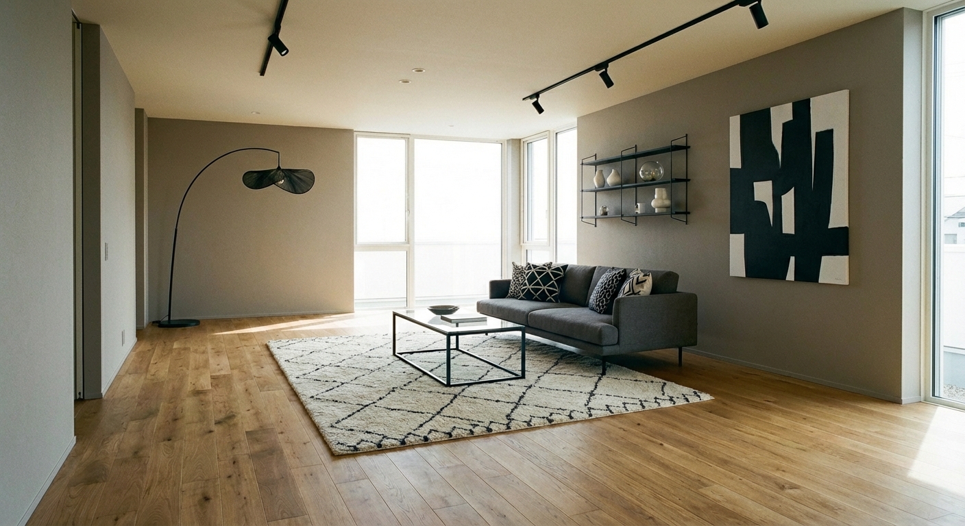

Upload your room photo in the app to see your real transformation
Why It Works
Coral (#FF7F50 to #E8725E range) and navy (#000080 to #1B2A4A range) sit near-opposite on the color wheel, creating the visual energy of complementary contrast without the harshness of pure orange and blue. Coral is the friendlier sibling of orange — warm, approachable, and cheerful without aggression. Navy is the sophisticated sibling of blue — deep, grounding, and versatile without coldness. The high contrast between light-warm coral and dark-cool navy creates rooms with immediate visual interest and energy. The palette suits rooms designed for activity and gathering — living rooms, dining rooms, and family rooms — where energy enhances the experience.
Best for
- people ready to test options on a real photo before buying
- anyone planning a real living room where conversation distance, TV glare, and traffic past the sofa matter more than Pinterest perfection
- projects already thinking about sofa, curtains, rug and needing a coherent layout
Skip if
- you will not address conversation distance and only want a filter look
- you refuse to remove anything and only add decor
Common mistakes
People pin coral living room ideas and then shopping object-by-object with no envelope decision. Details like sofa, curtains, rug only work if the plan respects conversation distance, TV glare, and traffic past the sofa. Another miss: pushing every seat against the walls and calling the empty middle “open”.
Decide this first
fix the primary seating pair and one clear path before decorative chairs. Lock a coherent material story instead of random catalog picks as a short list, then use Intero on a real photo so scale and light are honest before you spend.
How to Achieve This Look
Use navy as the grounding color (40-50%) — on an accent wall, a large sofa, or curtains. Introduce coral as the energizing accent (20-30%) through cushions, an armchair, art, or a statement rug. Use white or cream (30%) as the essential bridge color that prevents the palette from feeling heavy. The balance is critical: too much coral overwhelms, too much navy darkens. Materials should be a mix of polished and matte: velvet navy cushions, matte coral ceramic, glossy white surfaces, and natural wood for warmth. Metallic accents work in both brass (warm, complementing coral) and polished nickel (cool, complementing navy).
Color ratios are hard to predict in coral-navy schemes — the wrong balance feels either too dark or too loud. Intero AI previews different proportions in your room to find the exact coral-navy-white ratio that creates energetic balance.
Frequently Asked Questions
Q1 Where should I use coral versus navy?
Navy works best on large, recessive surfaces — an accent wall, a sofa, or curtains. Coral works best in smaller, attention-getting doses — cushions, art, a single armchair, or decorative objects. White should dominate the walls (unless navy is the accent wall) to keep the room bright.
Q2 Can I use coral and navy in a bedroom?
Yes — but shift the proportions. Use navy as the dominant (bedding, accent wall) for its calming depth, and add coral in small touches (throw pillows, a vase, artwork) for warmth. The energy of coral should be a whisper in a bedroom, not a shout.
Q3 What neutrals bridge coral and navy?
Warm white and cream are essential bridges. Warm gray (with taupe undertones) works as a secondary neutral. Natural wood tones (light oak or walnut) add warmth. Avoid cool gray, which flatters navy but clashes with coral warm undertones.
Related searches
These are the next pages people usually open while narrowing this design direction.
You Might Also Like
Ready to See This Style in Your Room?
Download Intero and preview this design on your own room photo.
No credit card. No signup. Just results.
Scan to download
Point your phone camera at a code

