How to Choose the Perfect Color Scheme for Any Room
Color sets the emotional tone of every room. This guide demystifies color theory and gives you a practical framework for choosing palettes that work.
What is How to Choose a Color Scheme for Any Room?
Color sets the emotional tone of every room. This guide demystifies color theory and gives you a practical framework for choosing palettes that work.
1/4
See the Transformation
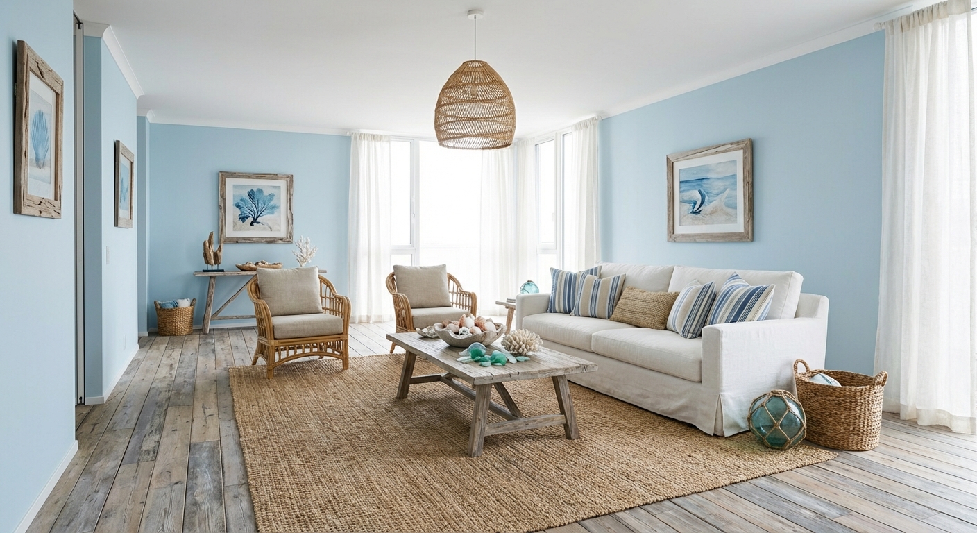

Upload your room photo in the app to see your real transformation
Color Palette
Click any color to copy hex code
Why It Works
Color affects mood, perceived space, and visual harmony. The 60-30-10 rule provides a reliable framework: 60% dominant color (walls, large furniture), 30% secondary color (curtains, accent chairs, rugs), and 10% accent color (throw pillows, art, accessories). This ratio creates visual balance that the eye finds naturally pleasing. Cool colors (blues, greens, grays) recede and make spaces feel larger. Warm colors (reds, oranges, yellows) advance and create intimacy.
Best for
- people ready to test options on a real photo before buying
- anyone planning a real living room where conversation distance, TV glare, and traffic past the sofa matter more than Pinterest perfection
- projects already thinking about curtains, paint and needing a coherent layout
Skip if
- you will not address conversation distance and only want a filter look
- you refuse to remove anything and only add decor
Common mistakes
People pin how living room ideas and then shopping object-by-object with no envelope decision. Details like curtains, paint only work if the plan respects conversation distance, TV glare, and traffic past the sofa. Another miss: pushing every seat against the walls and calling the empty middle “open”.
Decide this first
fix the primary seating pair and one clear path before decorative chairs. Lock a coherent material story instead of random catalog picks as a short list, then use Intero on a real photo so scale and light are honest before you spend.
How to Achieve This Look
- 1
Start with an inspiration piece like a fabric, artwork, or photo
- 2
Pull three to five colors from your inspiration
- 3
Apply the 60-30-10 rule to distribute colors
- 4
Test paint samples on the actual walls in different lighting
- 5
Check undertones — warm beige clashes with cool gray
- 6
Commit to the palette and carry it through every room element
Layout & materials
Start with inspiration — a piece of art, a textile, or a photo of a room you love. Extract three to four colors from it. Assign them to the 60-30-10 framework. Test paint samples on the wall in both natural and artificial light before committing. Consider the room direction: north-facing rooms benefit from warm tones, south-facing rooms can handle cooler shades. Keep adjoining rooms in the same color family for flow. When in doubt, start with a neutral base and add color through easily changeable elements like pillows and art.
Use the 60-30-10 rule: 60 percent dominant color on walls, 30 percent secondary on furniture, 10 percent accent in accessories.
Intero AI lets you preview different color schemes in your actual room before buying a single paint can. Upload a photo and test warm vs. cool palettes, bold vs. neutral schemes, and see exactly how natural light in your space affects each color choice.
Frequently Asked Questions
Q1 What is the 60-30-10 rule in interior design?
It means 60% of the room should be a dominant color (usually walls and large furniture), 30% should be a secondary color (curtains, rugs, accent furniture), and 10% should be an accent color (pillows, art, small accessories). This ratio creates natural visual balance.
Q2 How many colors should a room have?
Three to five colors work best. One dominant neutral, one secondary color for interest, and one or two accent colors for pops of personality. Too many colors create visual chaos; too few feel sterile.
Q3 Should I choose warm or cool colors for my room?
It depends on the room purpose and natural light. Bedrooms and living rooms benefit from warm tones that create intimacy. Bathrooms and offices often feel cleaner with cool tones. North-facing rooms need warm colors to compensate for blue-toned light.
Related searches
These are the next pages people usually open while narrowing this design direction.
Ready to See This Style in Your Room?
Download Intero and preview this design on your own room photo.
No credit card. No signup. Just results.
Scan to download
Point your phone camera at a code

