How to Design a Gallery Wall That Looks Curated, Not Cluttered
A great gallery wall tells a visual story. A bad one looks like a yard sale on your wall. These rules ensure your gallery wall looks intentionally designed.
What is How to Design a Gallery Wall That Looks Professional?
A great gallery wall tells a visual story. A bad one looks like a yard sale on your wall. These rules ensure your gallery wall looks intentionally designed.
1/4
See the Transformation
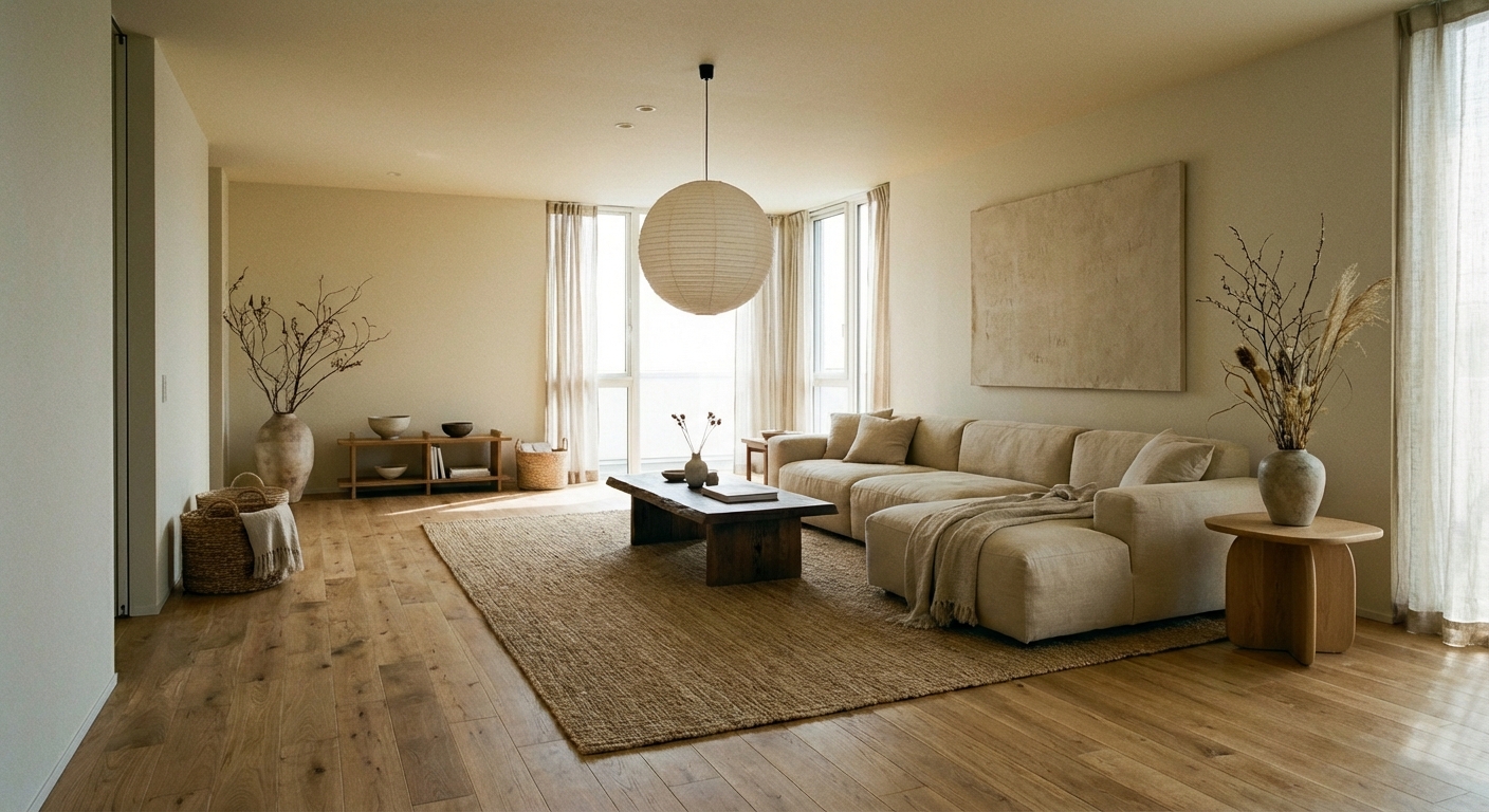

Upload your room photo in the app to see your real transformation
Color Palette
Click any color to copy hex code
Why It Works
Gallery walls work because they create a single large visual statement from multiple smaller pieces, turning a blank wall into the room focal point. The key is treating the entire collection as one composition rather than individual frames. Successful gallery walls have a unifying element — consistent frame color, a shared color palette in the art, or a common theme — that reads as intentional curation. The arrangement style (grid, salon, or linear) sets the mood: grids feel modern and orderly, salon-style feels eclectic and collected, linear arrangements feel clean and contemporary.
Best for
- people ready to test options on a real photo before buying
- anyone planning a real living room where conversation distance, TV glare, and traffic past the sofa matter more than Pinterest perfection
- projects that will change layout and light, not only accessories
Skip if
- you will not address conversation distance and only want a filter look
- you need the room finished tomorrow with zero test fits
Common mistakes
In a living room, “how” fails when you shopping object-by-object with no envelope decision. Respect conversation distance, TV glare, and traffic past the sofa before finishes. Another miss: pushing every seat against the walls and calling the empty middle “open”.
Decide this first
fix the primary seating pair and one clear path before decorative chairs. Lock a coherent material story instead of random catalog picks as a short list, then use Intero on a real photo so scale and light are honest before you spend.
How to Achieve This Look
- 1
Collect all pieces and lay them on the floor to plan the arrangement
- 2
Choose one frame color and stick with it — black, white, or natural wood
- 3
Start with the largest piece at eye level and build outward
- 4
Keep spacing consistent — 2-3 inches between all frames
- 5
Trace frames onto paper, cut out, and tape to the wall before hammering
- 6
Hang the center piece first, then work outward in all directions
Layout & materials
Choose your arrangement style: a structured grid (equal spacing, same-size frames) for modern rooms, or salon-style (varied sizes, organic arrangement) for eclectic spaces. Select a unifying element — matching frames are the easiest, but a shared color palette in the artwork also works. Start with the largest piece at eye level (57-60 inches from floor to center) and build outward. Maintain consistent spacing — 2-3 inches between frames for a tight, cohesive look. Lay out the arrangement on the floor first or trace frames on kraft paper and tape them to the wall before hammering any nails.
Use matching frames in the same color for a cohesive gallery wall — mismatched frames only work if you are very intentional about it.
Planning a gallery wall layout is one of the most stressful design decisions. Intero AI lets you upload a photo of your wall and preview different gallery arrangements, frame styles, and spacing options before putting a single hole in the wall.
Frequently Asked Questions
Q1 How many pieces should a gallery wall have?
A minimum of five pieces for impact — fewer looks sparse. For a full statement wall, 8-15 pieces works well. The key is having enough variety in size for visual interest while maintaining a unifying thread.
Q2 Do gallery wall frames need to match?
Not necessarily, but having a unifying element makes the wall cohesive. Matching frame color (all black, all white, all wood) is the easiest approach. If mixing frame styles, unify through a shared color palette in the artwork instead.
Q3 What is the ideal spacing between gallery wall frames?
Two to three inches between frames creates a tight, cohesive arrangement. More than four inches between frames makes the collection look disconnected. Consistency matters more than the exact measurement — keep spacing uniform throughout.
Related searches
These are the next pages people usually open while narrowing this design direction.
You Might Also Like
Ready to See This Style in Your Room?
Download Intero and preview this design on your own room photo.
No credit card. No signup. Just results.
Scan to download
Point your phone camera at a code

