Monochrome Beige — The Art of Tone-on-Tone Serenity
One color family, infinite tonal variation. The monochrome beige palette creates rooms that feel calm, layered, and deeply luxurious through texture rather than color.
What is Monochrome Beige Palette for Interiors?
One color family, infinite tonal variation. The monochrome beige palette creates rooms that feel calm, layered, and deeply luxurious through texture rather than color.
1/4
See the Transformation
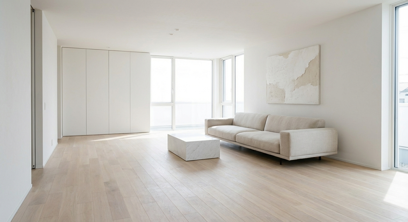

Upload your room photo in the app to see your real transformation
Color Palette
Click any color to copy hex code
Why It Works
Monochrome beige — using variations of a single warm neutral from pale cream to deep camel — is the palette of high-end minimalism and luxury hospitality. It works because removing color contrast forces the eye to notice texture, form, and light instead. A monochrome beige room is all about nuance: the sheen difference between matte plaster and glossy ceramic, the tactile contrast between rough linen and smooth leather, the depth created by shadows on tonal surfaces. This approach is influenced by the Japanese concept of kintsukuroi — finding beauty in subtlety. The result is rooms that feel extraordinarily calm and intentional. The palette has been adopted by luxury brands from Axel Vervoordt to The Row because it communicates quiet confidence and refined taste.
Best for
- people ready to test options on a real photo before buying
- anyone planning a real living room where conversation distance, TV glare, and traffic past the sofa matter more than Pinterest perfection
- projects already thinking about linen, curtain, rug and needing a coherent layout
Skip if
- you will not address conversation distance and only want a filter look
- you refuse to remove anything and only add decor
Common mistakes
People pin monochrome living room ideas and then shopping object-by-object with no envelope decision. Details like linen, curtain, rug only work if the plan respects conversation distance, TV glare, and traffic past the sofa. Another miss: pushing every seat against the walls and calling the empty middle “open”.
Decide this first
fix the primary seating pair and one clear path before decorative chairs. Lock a coherent material story instead of random catalog picks as a short list, then use Intero on a real photo so scale and light are honest before you spend.
How to Achieve This Look
- 1
Select five to six beige tones from light cream to deep tan
- 2
Assign the lightest tone to walls and ceiling
- 3
Use mid-tones for large furniture pieces and rugs
- 4
Reserve the darkest tone for accent pieces and trim details
- 5
Maximize textural variety — mix smooth, rough, woven, and plush
- 6
Add one organic element like a stone sculpture or driftwood piece
Layout & materials
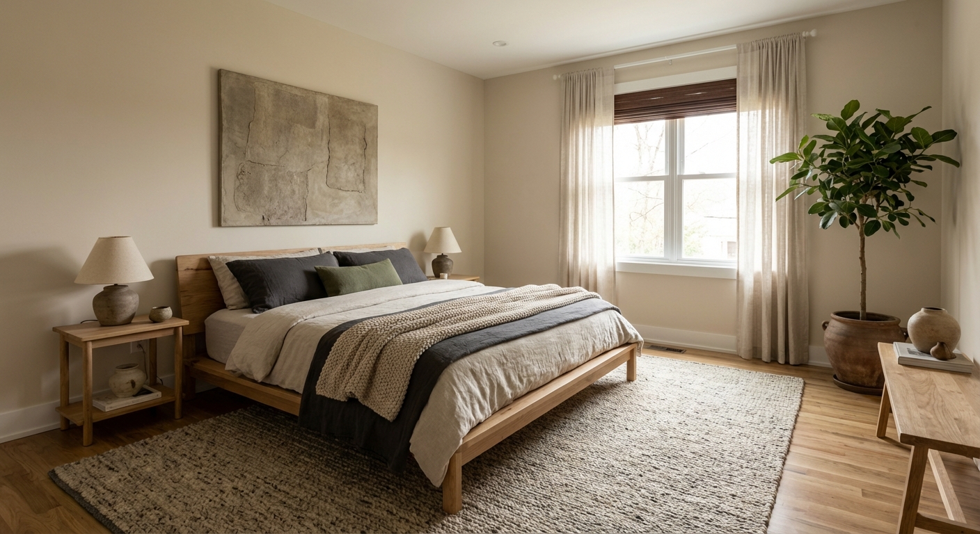
Choose five to seven tones within the beige family, from your lightest (cream or ecru) to your deepest (camel, caramel, or warm taupe). Use the lightest tones on walls and ceiling. Layer in progressively deeper tones through furniture, textiles, and accessories. The critical discipline is texture variation — without it, monochrome beige becomes boring. Mix rough and smooth: a plaster wall next to a leather chair next to a linen curtain next to a wool rug. Vary sheen: matte ceramics, satin brass, glossy lacquer, and raw wood can coexist. Natural materials are essential: stone, wood, leather, linen, wool, and clay all fall naturally within the beige spectrum. A single dark grounding element — a dark wood frame, a charcoal sculpture — prevents the palette from floating.
The key to monochrome beige is texture, not color — linen, bouclé, rattan, travertine, and leather all read as beige but feel completely different.
Monochrome beige is deceptively difficult — the tones must be close enough to read as cohesive but varied enough to avoid looking flat. Intero AI lets you test different beige tones in your room to find the exact range that creates depth and luxury rather than monotony.
Frequently Asked Questions
Q1 Is monochrome beige boring?
Only if you neglect texture. A monochrome beige room with uniform smooth surfaces is dull. The same room with plaster walls, a linen sofa, a leather chair, a jute rug, and a stone coffee table is anything but boring — the material variation creates richness that color-dependent palettes often lack.
Q2 How do I add interest to an all-beige room?
Vary texture aggressively: combine at least five different materials and surface finishes. Use architectural details like fluted paneling or arched doorways. Introduce one organic accent — a sculptural plant, a piece of raw wood, or an unglazed ceramic — as a focal point.
Q3 Is beige still relevant or is it dated?
Builder-grade beige is dated. Intentional monochrome beige — the sophisticated, texture-driven approach seen in high-end design — is more popular than ever. The difference is curation. A room that happens to be beige looks dated; a room deliberately designed in tonal beige looks luxurious.
Related searches
These are the next pages people usually open while narrowing this design direction.
Ready to See This Style in Your Room?
Download Intero and preview this design on your own room photo.
No credit card. No signup. Just results.
Scan to download
Point your phone camera at a code

