Navy & Gold — The Color Scheme That Radiates Luxury
Deep navy paired with warm gold creates one of the most timeless and sophisticated color combinations in interior design. This is understated luxury made visual.
What is Navy & Gold Color Scheme for Interiors?
Deep navy paired with warm gold creates one of the most timeless and sophisticated color combinations in interior design. This is understated luxury made visual.
2/4
See the Transformation
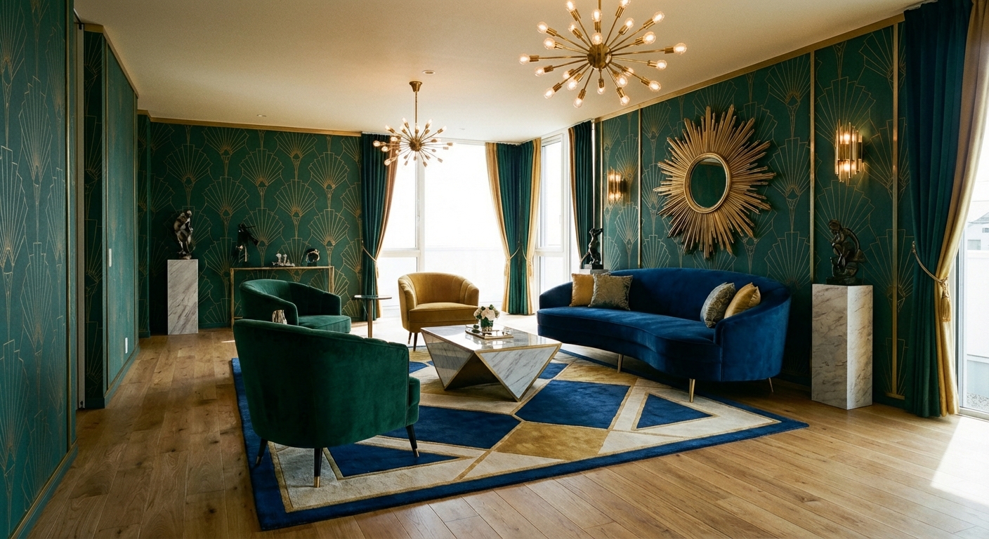

Upload your room photo in the app to see your real transformation
Color Palette
Click any color to copy hex code
Why It Works
Navy and gold is a pairing rooted in centuries of luxury symbolism — from naval uniforms to royal courts. Navy blue carries the trust and depth of the ocean, while gold communicates warmth, wealth, and optimism. Together they create a sophisticated tension between restraint and opulence. The combination follows the 60-30-10 rule beautifully: 60% navy on walls or large furniture, 30% white or cream as a brightening neutral, and 10% gold in hardware, lighting, and accessories. This palette works across design styles — it reads as classic in a traditional room, glamorous in Art Deco, and commanding in modern spaces.
Best for
- people ready to test options on a real photo before buying
- anyone planning a real living room where conversation distance, TV glare, and traffic past the sofa matter more than Pinterest perfection
- projects already thinking about lighting, paint, sofa and needing a coherent layout
Skip if
- you will not address conversation distance and only want a filter look
- you need the room finished tomorrow with zero test fits
Common mistakes
The usual navy living room miss is shopping object-by-object with no envelope decision. Details like lighting, paint, sofa only work if the plan respects conversation distance, TV glare, and traffic past the sofa. Another miss: pushing every seat against the walls and calling the empty middle “open”.
Decide this first
fix the primary seating pair and one clear path before decorative chairs. Lock a coherent material story instead of random catalog picks as a short list, then use Intero on a real photo so scale and light are honest before you spend.
How to Achieve This Look
- 1
Paint one accent wall or the full room in deep navy
- 2
Swap all hardware — knobs, pulls, fixtures — to brushed gold
- 3
Add a gold-framed mirror or set of gold-framed art prints
- 4
Choose cream or ivory soft furnishings to lighten the scheme
- 5
Layer rich textures like velvet and silk against the dark walls
- 6
Use warm white lighting to bring out the gold tones
Layout & materials
Paint one or more walls in deep navy — Benjamin Moore Hale Navy or Sherwin-Williams Naval are trusted choices. Balance the darkness with white or cream on the remaining walls, trim, and ceiling to prevent the room from feeling like a cave. Introduce gold through hardware (drawer pulls, door handles), lighting (brass pendants, gold-framed sconces), and accessories (mirrors, picture frames, decorative objects). A navy velvet sofa with gold legs makes a stunning centerpiece. Add texture with navy linen curtains, a cream wool rug, and gold-threaded throw pillows. Keep the rest of the palette simple — too many additional colors dilute the impact of the navy-gold duo.
Use gold sparingly and in small doses — hardware, frame edges, lamp bases. Too much gold tips from elegant to gaudy fast.
Navy walls are a bold commitment — the wrong shade or proportion can make a room feel dark and oppressive. Intero AI lets you test navy walls in your exact room with your natural light, showing you how much navy your space can handle before it overwhelms. Experiment with accent walls versus full navy to find the right balance.
Frequently Asked Questions
Q1 Does navy and gold work in small rooms?
Yes, but use navy selectively — a single accent wall or navy furniture against lighter walls. In small rooms, let white or cream dominate (60%) with navy as the 30% and gold as the 10%. The richness of the palette adds character without needing a large canvas.
Q2 What third color pairs well with navy and gold?
White and cream are the essential third color. For a fourth accent, consider blush pink for softness, emerald green for richness, or warm gray for a more restrained approach. Avoid competing bold colors that would dilute the navy-gold impact.
Q3 Which rooms suit navy and gold best?
Living rooms, bedrooms, dining rooms, and bathrooms all work beautifully. Navy and gold is particularly striking in bedrooms where the deep color promotes restful sleep, and in dining rooms where it creates an intimate, evening-appropriate atmosphere.
Related searches
These are the next pages people usually open while narrowing this design direction.
Ready to See This Style in Your Room?
Download Intero and preview this design on your own room photo.
No credit card. No signup. Just results.
Scan to download
Point your phone camera at a code

