Ocean Blues — A Palette as Calming as the Sea
From the palest sky to the deepest navy, ocean blues create interiors that feel expansive, serene, and connected to the natural world.
What is Ocean Blues Color Palette for Interiors?
From the palest sky to the deepest navy, ocean blues create interiors that feel expansive, serene, and connected to the natural world.
1/4
See the Transformation
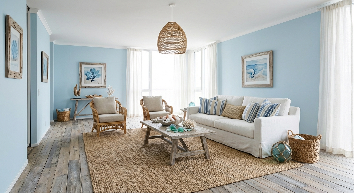

Upload your room photo in the app to see your real transformation
Color Palette
Click any color to copy hex code
Why It Works
Blue is consistently ranked as the world most popular color, and for good reason. Research shows that blue environments lower heart rate, reduce anxiety, and promote focus. Ocean blues — a spectrum from pale aqua to deep indigo — capture the calming effect of water and sky. The palette offers extraordinary versatility: light blues create airiness and perceived space, medium blues add color without overwhelming, and dark blues create intimate, cocooning environments. The tonal range means you can build an entire room using only blues and still achieve depth, contrast, and visual interest. Blue also pairs naturally with virtually every neutral, making it a foolproof accent choice.
Best for
- people ready to test options on a real photo before buying
- anyone planning a real living room where conversation distance, TV glare, and traffic past the sofa matter more than Pinterest perfection
- projects already thinking about marble, linen, rug and needing a coherent layout
Skip if
- you will not address conversation distance and only want a filter look
- you refuse to remove anything and only add decor
Common mistakes
People pin ocean living room ideas and then shopping object-by-object with no envelope decision. Details like marble, linen, rug only work if the plan respects conversation distance, TV glare, and traffic past the sofa. Another miss: pushing every seat against the walls and calling the empty middle “open”.
Decide this first
fix the primary seating pair and one clear path before decorative chairs. Lock a coherent material story instead of random catalog picks as a short list, then use Intero on a real photo so scale and light are honest before you spend.
How to Achieve This Look
- 1
Choose a soft sky blue or pale aqua for the main wall color
- 2
Use crisp white for trim and architectural details
- 3
Layer deeper blues through furniture, art, and textiles
- 4
Add sandy neutrals and driftwood tones for warmth
- 5
Incorporate natural textures — linen, rope, woven seagrass
- 6
Use clear glass and white ceramic accessories for a clean finish
Layout & materials
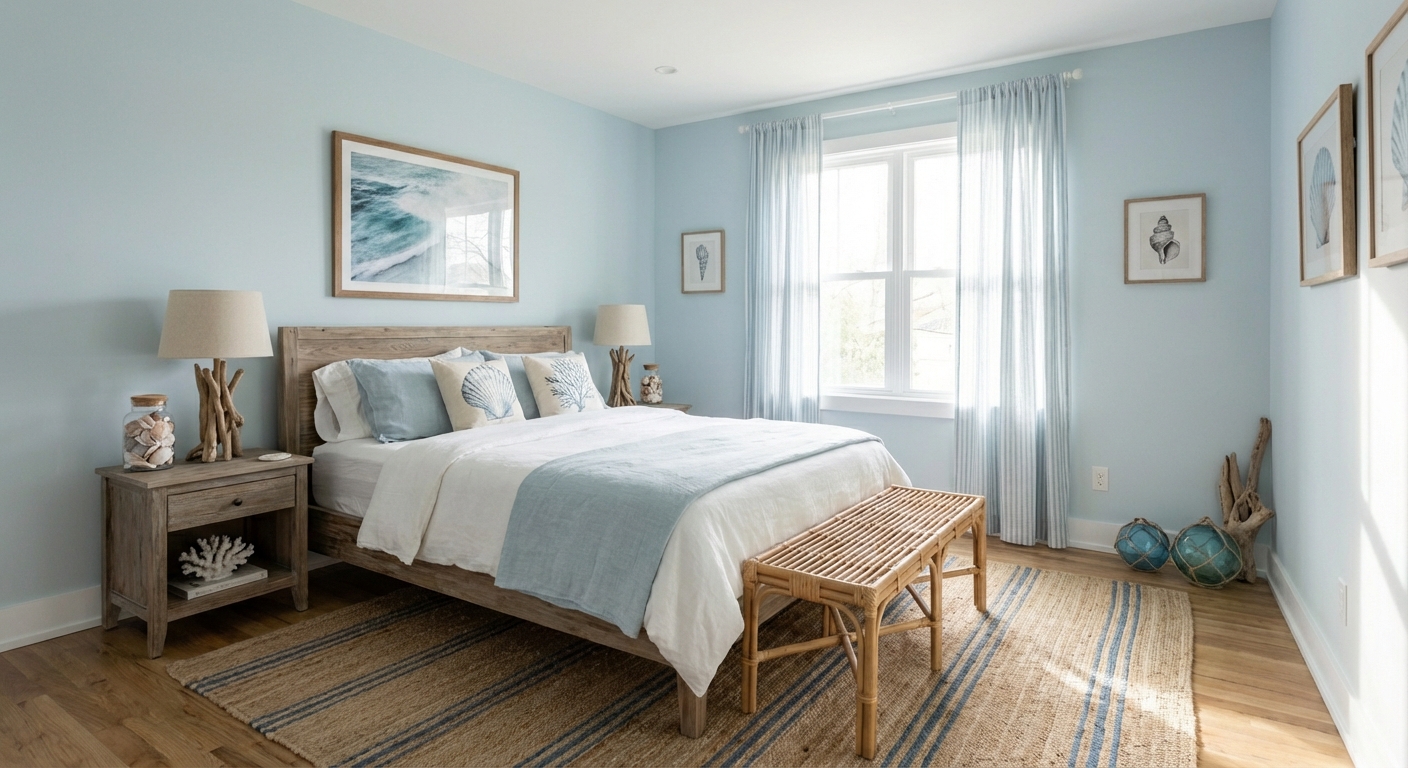
Build the palette from light to dark: pale blue or white on the ceiling (the sky), medium blue on walls or large surfaces (the horizon), and deeper navy or indigo in grounding elements like rugs, anchor furniture, or accent pieces (the deep water). Layer different blue tones rather than using a single shade — this mimics the natural variation of ocean color and prevents flatness. Materials should complement the cool tones: white marble, driftwood, bleached linen, chrome or silver hardware. Add warmth with natural fiber accents — a jute rug, woven rattan, or warm wood frames — to prevent all-blue palettes from feeling cold.
Layer at least four shades of blue from sky to navy — a single blue looks flat, but a gradient creates depth and movement.
Blue interacts dramatically with natural light — a blue that looks perfect in a south-facing showroom can feel icy in a north-facing room. Intero AI shows you exactly how different blues will look in your space with your lighting conditions, from morning to evening.
Frequently Asked Questions
Q1 What shades of blue work best for walls?
Light rooms can handle deeper blues (navy, deep teal) for drama. Dark or north-facing rooms benefit from lighter blues (powder blue, pale aqua) to maintain brightness. Medium blues like cornflower and slate blue are the most universally flattering.
Q2 How do I prevent an all-blue room from feeling cold?
Add warm materials: natural wood, rattan, jute, and warm metals like brass or copper. Use warm white rather than cool white as the base neutral. Consider choosing blues with warm undertones — teal, petrol blue, and indigo are warmer than sky blue or periwinkle.
Q3 Does ocean blue only work for coastal style?
Not at all. Navy and indigo are staples of traditional and Art Deco design. Slate blue fits modern and Scandinavian interiors. Teal works in bohemian and mid-century modern rooms. The ocean blue palette transcends any single design style.
Related searches
These are the next pages people usually open while narrowing this design direction.
Ready to See This Style in Your Room?
Download Intero and preview this design on your own room photo.
No credit card. No signup. Just results.
Scan to download
Point your phone camera at a code

