Pastels — Light, Airy Color That Lifts Every Room
Pastels are not just for nurseries. When used with intention, these soft, light-filled colors create sophisticated spaces that feel optimistic and serene.
What is Pastel Color Palette for Interiors?
Pastels are not just for nurseries. When used with intention, these soft, light-filled colors create sophisticated spaces that feel optimistic and serene.
1/4
See the Transformation
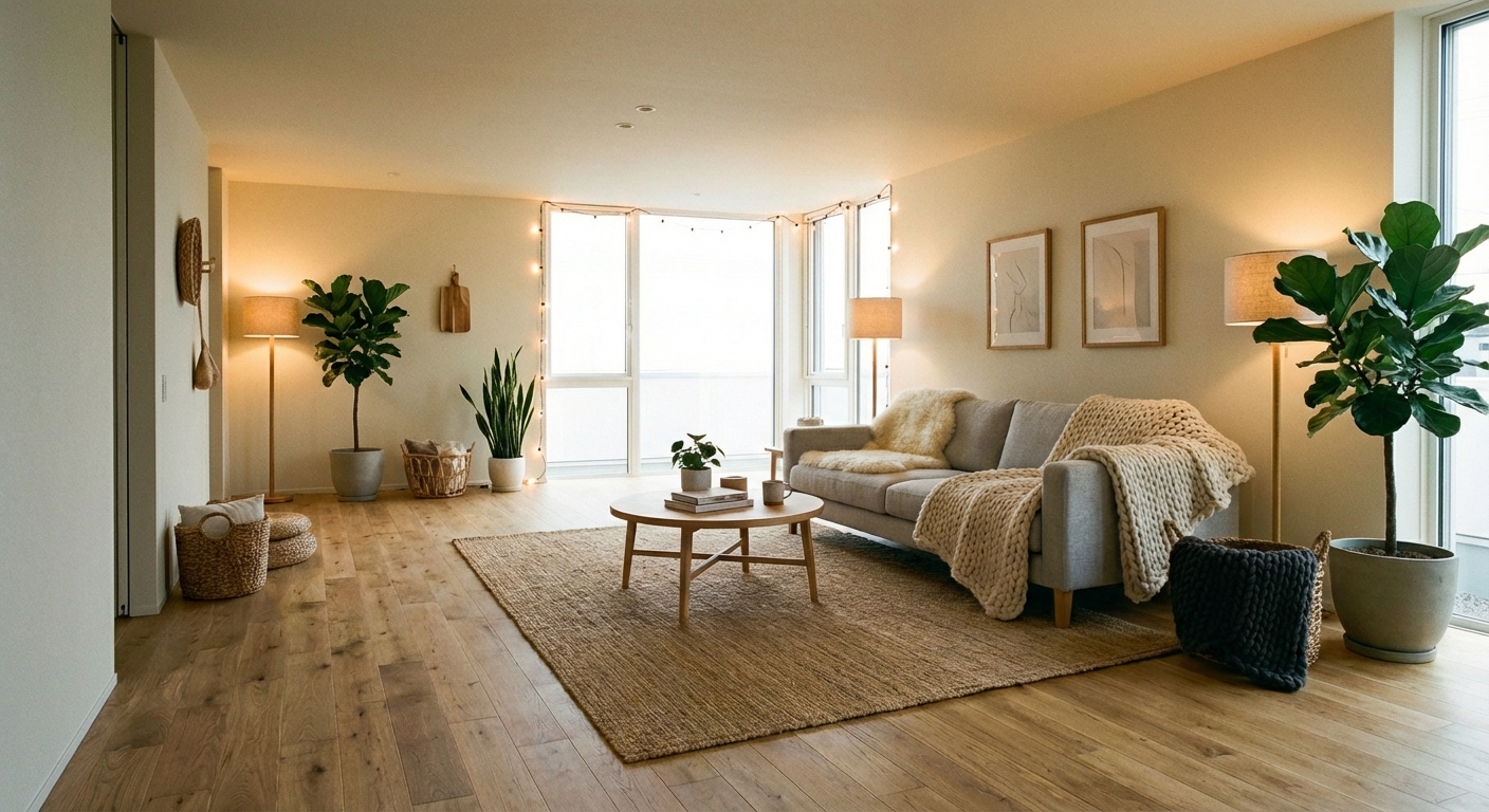

Upload your room photo in the app to see your real transformation
Color Palette
Click any color to copy hex code
Why It Works
Pastels are colors mixed with white to reduce their saturation, resulting in soft tones that reflect more light than their deeper counterparts. This light-reflective quality makes pastel rooms feel brighter and more spacious. The gentle saturation also makes pastels inherently calming — they carry the personality of their parent hue (blue, green, pink, yellow) without the intensity. When combined, pastels create a palette reminiscent of spring gardens, watercolor paintings, and seaside sunsets — all associations that trigger positive emotional responses. The challenge is using pastels in a way that reads as sophisticated rather than childish, which comes down to proportion, pairing, and material choices.
Best for
- people ready to test options on a real photo before buying
- anyone planning a real living room where conversation distance, TV glare, and traffic past the sofa matter more than Pinterest perfection
- projects already thinking about marble, linen and needing a coherent layout
Skip if
- you will not address conversation distance and only want a filter look
- you need the room finished tomorrow with zero test fits
Common mistakes
People pin pastel living room ideas and then shopping object-by-object with no envelope decision. Details like marble, linen only work if the plan respects conversation distance, TV glare, and traffic past the sofa. Another miss: pushing every seat against the walls and calling the empty middle “open”.
Decide this first
fix the primary seating pair and one clear path before decorative chairs. Lock a coherent material story instead of random catalog picks as a short list, then use Intero on a real photo so scale and light are honest before you spend.
How to Achieve This Look
- 1
Start with bright white walls and ceiling as the canvas
- 2
Choose two or three pastels from different color families
- 3
Introduce pastels through soft furnishings — pillows, throws, and rugs
- 4
Use white or light wood furniture to keep the look fresh
- 5
Add subtle metallic accents in gold or silver
- 6
Avoid mixing too many pastels — three is enough to keep it cohesive
Layout & materials
Avoid using pastels wall-to-wall without grounding elements — this is what creates the nursery effect. Instead, pair pastels with strong neutrals: crisp white, warm gray, or even charcoal to provide contrast and sophistication. Choose one or two pastel tones rather than the full rainbow — lavender and soft mint, or pale pink and powder blue. Materials should add weight: marble, brass, natural wood, and textured fabrics like linen and boucle prevent pastels from feeling insubstantial. Use the 60-30-10 rule with 60% white or warm neutral, 30% your primary pastel, and 10% a grounding dark tone or metallic. Modern pastel palettes lean toward muted, gray-infused versions rather than candy-bright tones.
Pastels need crisp white to pop — without enough white as a backdrop, they can look washed out instead of fresh.
Pastel shades can look dramatically different on a wall than on a paint chip — many read as nearly white in bright light or overly saturated in dim rooms. Intero AI lets you preview pastel wall colors, furniture, and textiles in your actual room to ensure the tone is visible but not overwhelming.
Frequently Asked Questions
Q1 How do I use pastels without looking childish?
Pair pastels with grounding elements: dark accents, metallic hardware, natural wood, and mature materials like marble and velvet. Choose muted, gray-toned pastels rather than candy-bright versions. Using just one or two pastel shades with plenty of neutral prevents the sweet overload.
Q2 What pastel combinations work best together?
Analogous pairs are safest: soft pink and lavender, mint and pale blue, or peach and butter yellow. Complementary pairs add more interest: powder blue and blush pink, or soft green and pale coral. Limit yourself to two pastels per room for sophistication.
Q3 Do pastels work in dark rooms?
Pastels need light to read correctly. In dark rooms, they can appear dull or muddy. If your room is north-facing or receives limited light, choose warmer pastels (peach, butter) over cool ones (mint, lavender), and ensure adequate artificial lighting.
Related searches
These are the next pages people usually open while narrowing this design direction.
Ready to See This Style in Your Room?
Download Intero and preview this design on your own room photo.
No credit card. No signup. Just results.
Scan to download
Point your phone camera at a code

