Terracotta & Rust — Warmth That Feels Ancient and Modern at Once
Sun-baked clay, iron oxide, and autumn leaves — terracotta and rust bring a warmth and earthiness that synthetic colors cannot replicate.
What is Terracotta & Rust Color Scheme for Interiors?
Sun-baked clay, iron oxide, and autumn leaves — terracotta and rust bring a warmth and earthiness that synthetic colors cannot replicate.
1/4
See the Transformation
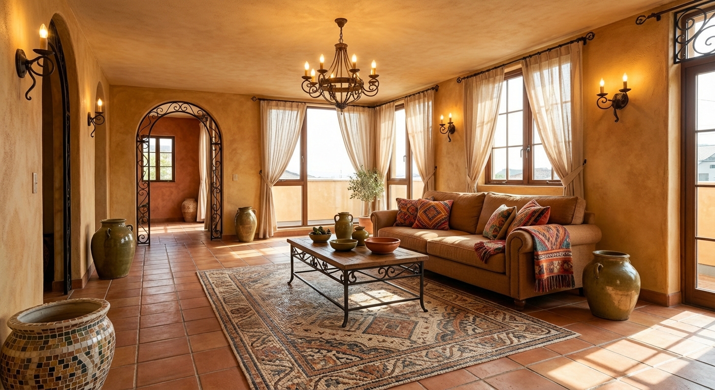

Upload your room photo in the app to see your real transformation
Color Palette
Click any color to copy hex code
Why It Works
Terracotta and rust are colors of the earth — literally derived from clay and iron ore. These tones carry thousands of years of architectural heritage, from Roman villas to Moroccan riads to Southwestern adobe. The colors create warmth through their red-orange undertones, which the brain associates with fire, sunlight, and hearth. Unlike bright orange, which can feel aggressive, terracotta and rust are muted and grayed-down, making them sophisticated enough for any room. This palette also shifts beautifully with light — terracotta glows golden in morning sun and deepens to warm amber in evening light, creating rooms that feel dynamic throughout the day.
Best for
- people ready to test options on a real photo before buying
- anyone planning a real living room where conversation distance, TV glare, and traffic past the sofa matter more than Pinterest perfection
- projects already thinking about rug, tile, linen and needing a coherent layout
Skip if
- you will not address conversation distance and only want a filter look
- you refuse to remove anything and only add decor
Common mistakes
The usual terracotta living room miss is shopping object-by-object with no envelope decision. Details like rug, tile, linen only work if the plan respects conversation distance, TV glare, and traffic past the sofa. Another miss: pushing every seat against the walls and calling the empty middle “open”.
Decide this first
fix the primary seating pair and one clear path before decorative chairs. Lock a coherent material story instead of random catalog picks as a short list, then use Intero on a real photo so scale and light are honest before you spend.
How to Achieve This Look
- 1
Start with a warm off-white or sand base on walls
- 2
Add terracotta through ceramic pots, tiles, or a painted accent wall
- 3
Introduce rust tones via textiles — a kilim rug, cushions, or curtains
- 4
Use matte bronze or aged copper hardware and fixtures
- 5
Pair with deep olive green for a complementary accent
- 6
Layer natural textures — jute, linen, raw clay, and unfinished wood
Layout & materials
Use a warm neutral base — warm white, sand, or cream — as your 60% foundation. Introduce terracotta as the primary accent (30%) through an accent wall, pottery, upholstery, or a large rug. Use deeper rust as a supporting accent (10%) in cushions, art, or smaller accessories. The palette comes alive with natural materials: actual terracotta tile or pots, linen in rust tones, rattan furniture, and raw wood. Pair with olive green or sage for a nature-inspired complement, or with navy blue for sophisticated contrast. Avoid using terracotta on all walls — it is most effective as a focal point against a lighter backdrop.
Ground terracotta with plenty of off-white and cream — it needs breathing room or the warmth becomes overwhelming.
Terracotta intensity varies dramatically between brands and finishes, and it interacts strongly with surrounding colors. Intero AI lets you test terracotta accent walls, floor tiles, and upholstery in your room to see exactly how the warmth reads in your space before investing in paint or materials.
Frequently Asked Questions
Q1 Is terracotta a trendy color that will go out of style?
Terracotta has been used in architecture and interiors for millennia. While its current popularity as a wall color and decor accent may fade from trend lists, the color itself is timeless. Terracotta tile, pottery, and natural clay accessories never go out of style.
Q2 What colors complement terracotta and rust?
Olive green and sage create a natural pairing. Navy blue provides sophisticated contrast. Cream and warm white are essential neutrals. Dusty pink adds softness. Avoid cool grays and bright blues, which clash with terracotta warm undertone.
Q3 Which rooms suit terracotta best?
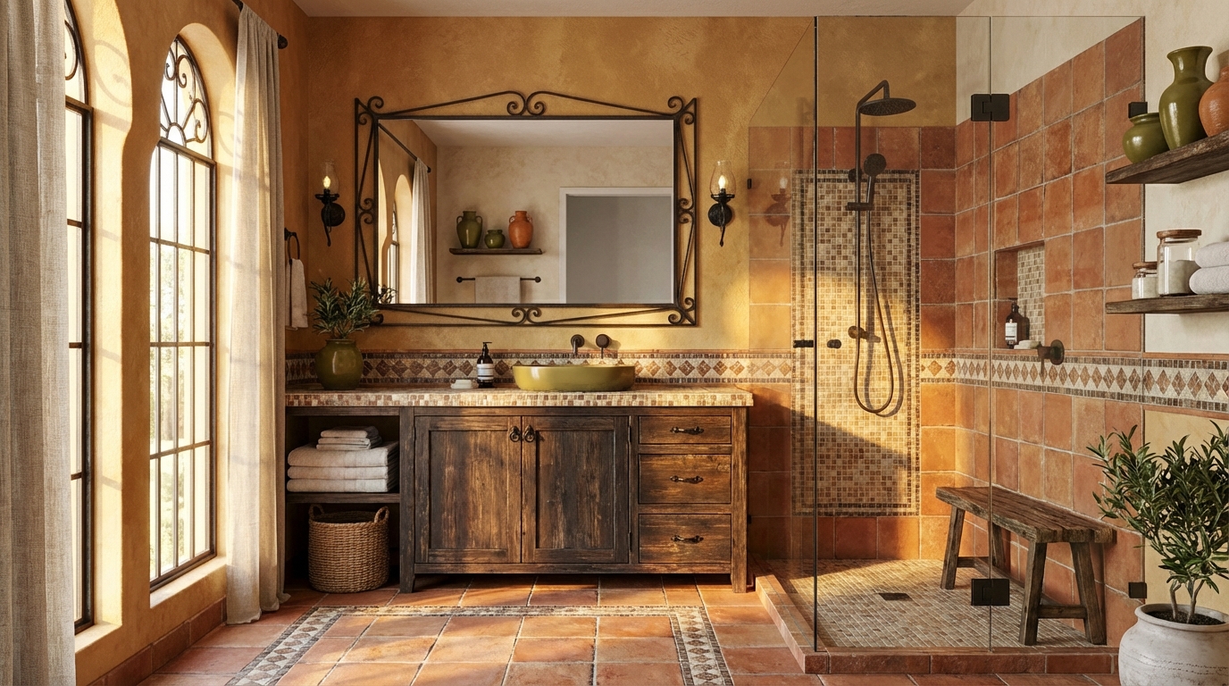
Living rooms (accent wall or pottery), kitchens (terracotta tile or backsplash), bedrooms (bedding or wall color), and patios (natural terracotta pots and tile). Bathrooms with terracotta zellige tile are particularly striking.
Related searches
These are the next pages people usually open while narrowing this design direction.
Ready to See This Style in Your Room?
Download Intero and preview this design on your own room photo.
No credit card. No signup. Just results.
Scan to download
Point your phone camera at a code

