The Warm Neutral Palette That Makes Any Room Feel Like Home
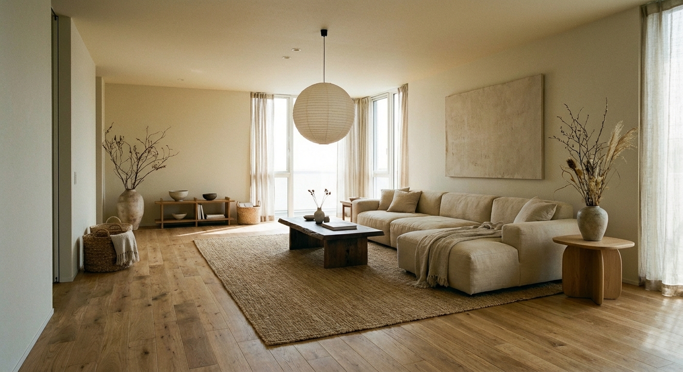
Cream, taupe, caramel, and warm gray create a foundation that feels sophisticated and inviting without committing to a specific style. This is the palette designers return to again and again.
What is Warm Neutral Color Palette for Interiors?
Cream, taupe, caramel, and warm gray create a foundation that feels sophisticated and inviting without committing to a specific style. This is the palette designers return to again and again.
1/4
See the Transformation
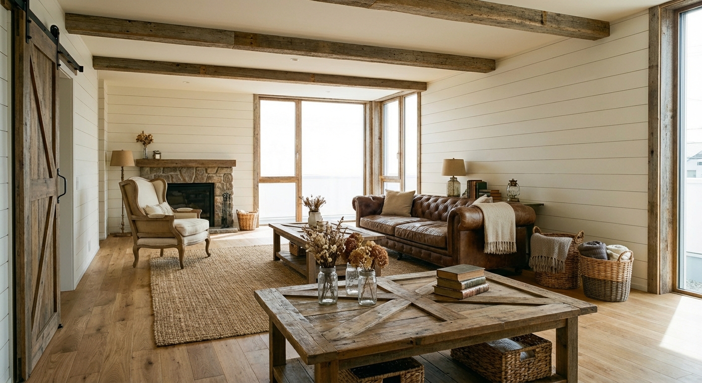

Upload your room photo in the app to see your real transformation
Color Palette
Click any color to copy hex code
Why It Works
Warm neutrals succeed because they replicate the colors found in natural materials — sand, stone, wood, and clay — which the human eye finds inherently comforting. Color psychology research shows that warm tones promote feelings of safety and relaxation, which is why they are the default palette for hospitality design. The 60-30-10 rule applies naturally: 60% warm white or cream on walls and large surfaces, 30% medium tones like taupe or caramel on furniture and rugs, and 10% darker accents in chocolate or warm charcoal. This palette is also forgiving — warm neutrals coordinate with virtually any accent color, making it easy to refresh a room with new textiles without repainting.
Best for
- people ready to test options on a real photo before buying
- anyone planning a real living room where conversation distance, TV glare, and traffic past the sofa matter more than Pinterest perfection
- projects already thinking about paint, linen, sofa and needing a coherent layout
Skip if
- you will not address conversation distance and only want a filter look
- you need the room finished tomorrow with zero test fits
Common mistakes
People pin warm living room ideas and then shopping object-by-object with no envelope decision. Details like paint, linen, sofa only work if the plan respects conversation distance, TV glare, and traffic past the sofa. Another miss: pushing every seat against the walls and calling the empty middle “open”.
Decide this first
fix the primary seating pair and one clear path before decorative chairs. Lock a coherent material story instead of random catalog picks as a short list, then use Intero on a real photo so scale and light are honest before you spend.
How to Achieve This Look
- 1
Choose a warm white with yellow or pink undertones for walls
- 2
Layer at least three different neutral tones from light to dark
- 3
Add texture through linen, wool, and natural wood to prevent flatness
- 4
Use brass or gold hardware to reinforce the warm tone
- 5
Ground the room with a darker neutral on the floor or large rug
- 6
Add one cream or ivory accent piece to brighten the palette
Layout & materials
Choose a warm white paint with yellow or pink undertones for walls — avoid blue-based whites that read as cold. Layer in medium-depth neutrals through a linen sofa in taupe, a jute rug in natural tan, and curtains in soft cream. Add depth with darker warm tones: a walnut coffee table, chocolate leather pillows, or a caramel throw. Introduce subtle texture variation — a boucle armchair, a woven basket, a linen lampshade — to prevent the monochrome palette from feeling flat. Metallics should be warm: brass, gold, or aged copper rather than silver or chrome.
Test warm neutrals against your fixed elements — countertops, flooring, trim — in both daylight and evening light before committing.
Warm neutrals look dramatically different depending on your room natural light. Intero AI shows you exactly how cream, taupe, and caramel tones would look in your specific space at different times of day, helping you choose the right undertones before committing to paint and furniture.
Frequently Asked Questions
Q1 How do I keep a warm neutral room from looking boring?
Texture is the key. Vary surfaces — smooth leather, rough linen, woven jute, soft boucle, matte ceramic — so the eye stays engaged even without color contrast. Adding one or two organic elements like a plant or a piece of driftwood also prevents flatness.
Q2 What accent colors work with warm neutrals?
Nearly everything. For a classic look, add terracotta or rust. For freshness, introduce sage green or dusty blue. For drama, use black or deep charcoal. Warm neutrals are the most versatile foundation in interior design.
Q3 Which warm neutral paint color is most popular?
Benjamin Moore White Dove, Sherwin-Williams Accessible Beige, and Farrow & Ball Skimming Stone are consistently top choices. The right pick depends on your light — test samples on the wall and observe them at different times of day.
Related searches
These are the next pages people usually open while narrowing this design direction.
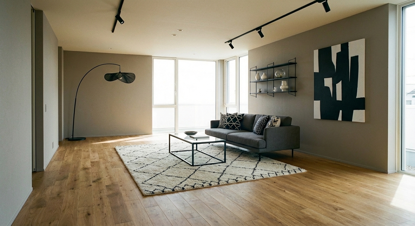
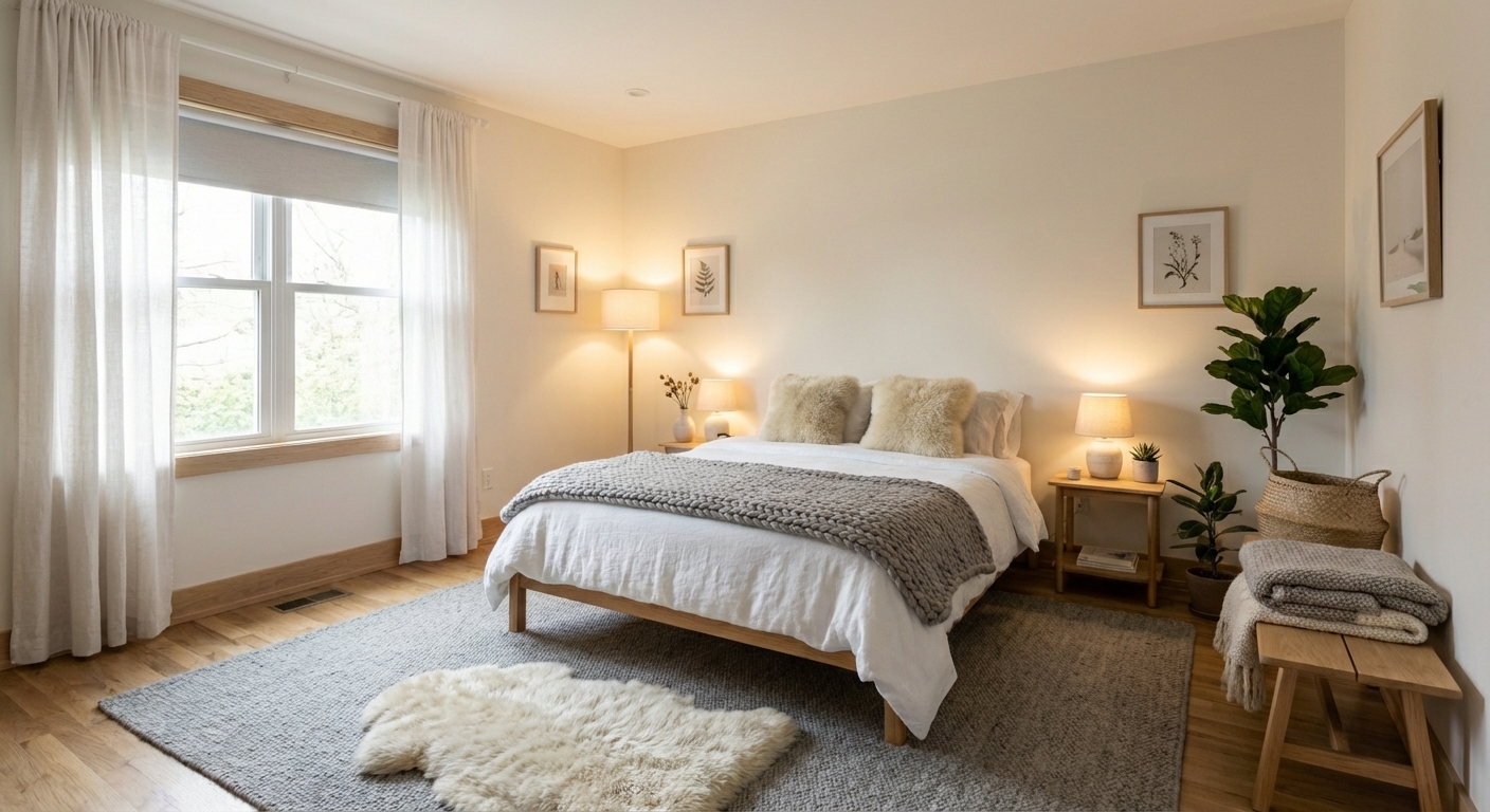
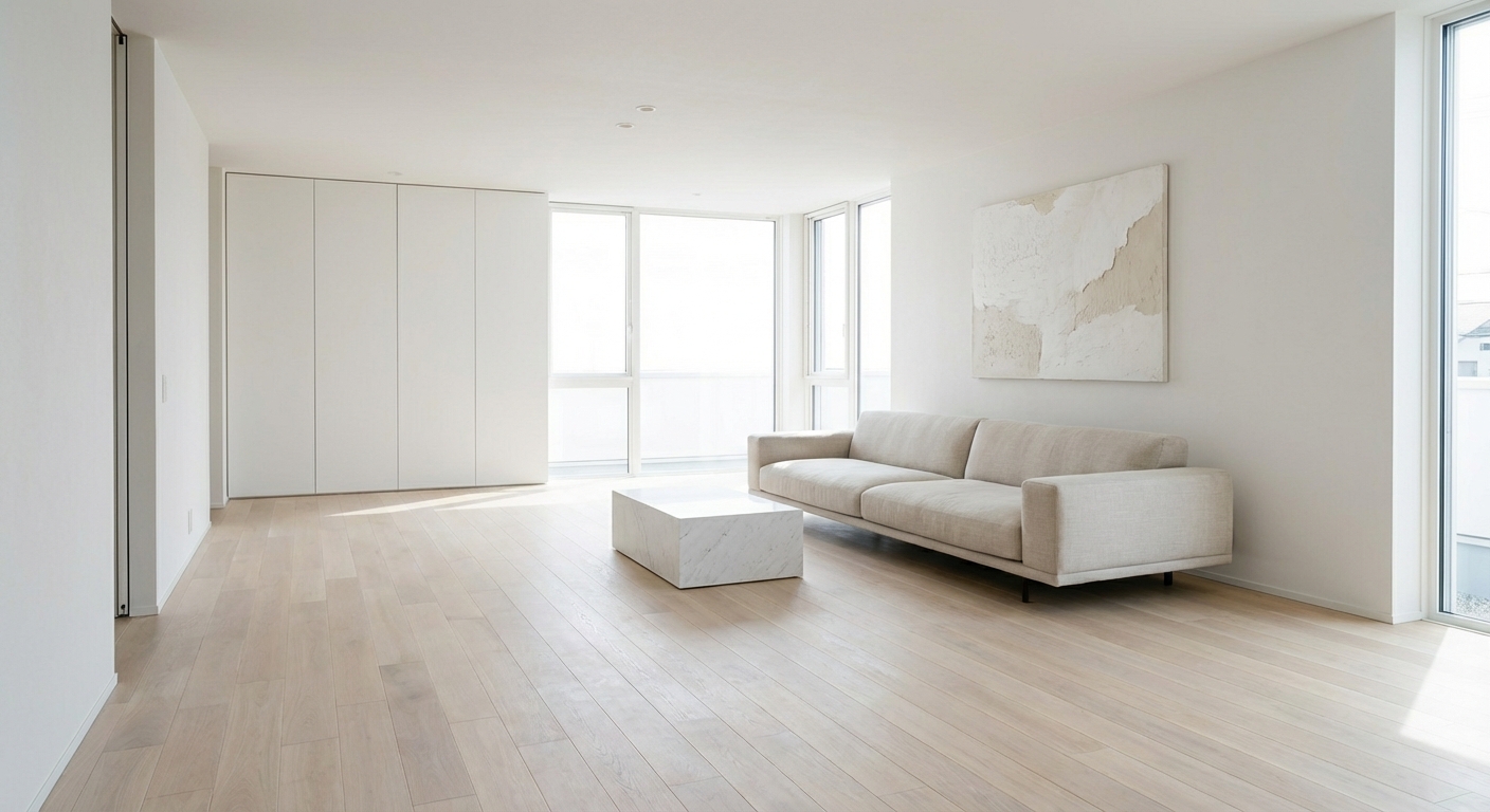
Ready to See This Style in Your Room?
Download Intero and preview this design on your own room photo.
No credit card. No signup. Just results.
Scan to download
Point your phone camera at a code

