Earth Tones — The Palette That Grounds Any Room in Nature
Drawn from the landscape itself — clay, stone, moss, and bark — earth tones create interiors that feel organic, grounded, and eternally in style.
$
変身を見る

アプリで部屋の写真をアップロードして、実際の変身を確認しましょう
カラーパレット
なぜうまくいくのか
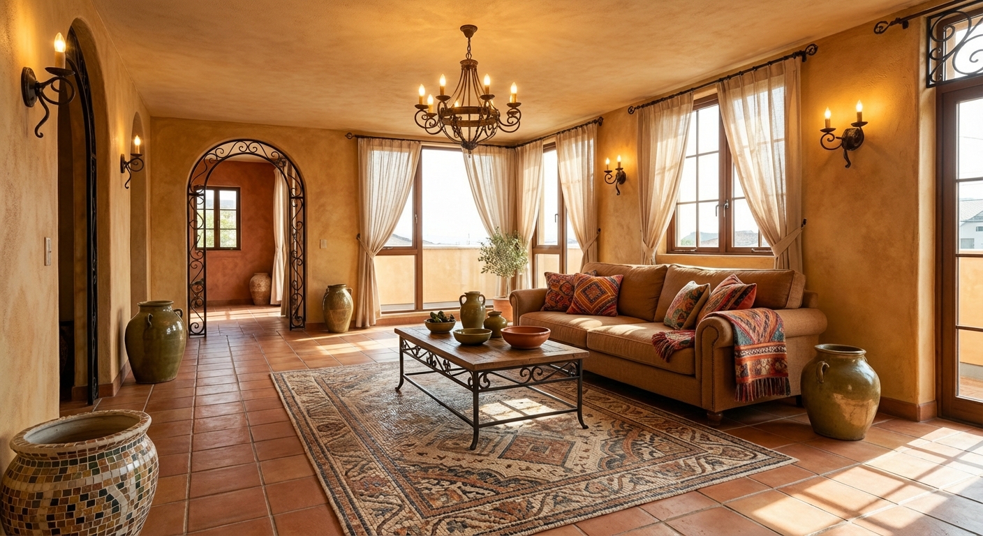
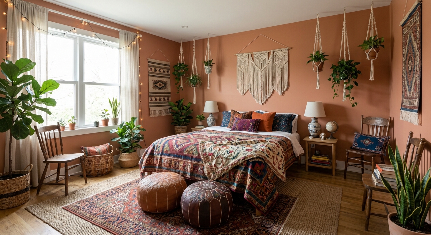
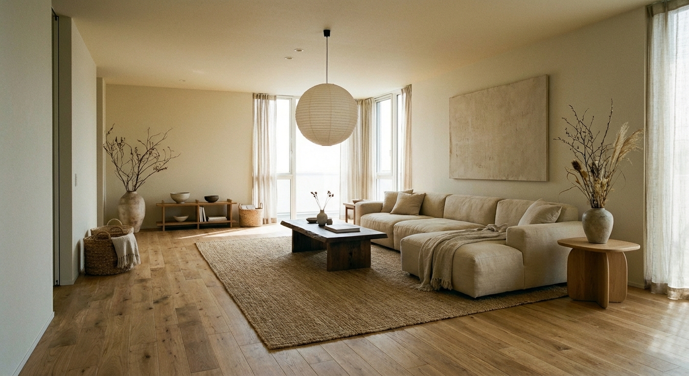
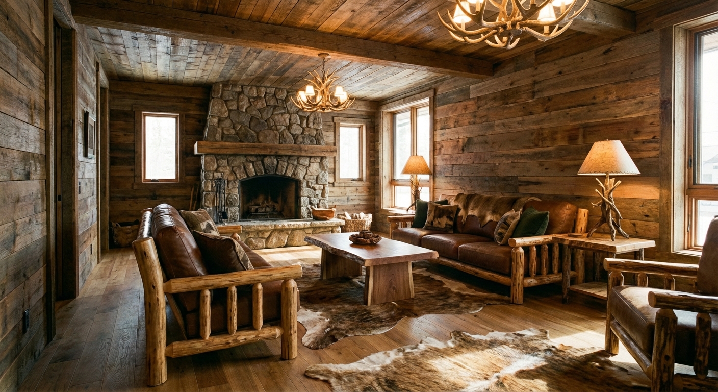
Earth tones are the colors of the natural world — terracotta, ochre, olive, clay, sienna, and umber. Humans evolved surrounded by these colors, which is why they register as inherently calming and familiar. Research in biophilic design shows that natural color palettes reduce stress and increase feelings of connection to the environment. The earth tone palette offers remarkable range despite its organic origin: warm reds from clay, greens from foliage, yellows from sand, and browns from soil create a full spectrum that never feels garish. Following the 60-30-10 rule: 60% warm neutral base (cream, sand, or warm white), 30% medium earth tones (terracotta, olive, ochre), and 10% dark anchoring tones (deep brown, charcoal, or black).
このスタイルを実現する方法
- 1
Choose a warm cream or sand for the base wall color
- 2
Introduce terracotta through pottery, cushions, or a rug
- 3
Add olive green via plants, textiles, or painted furniture
- 4
Use warm brown leather or wood as an anchoring element
- 5
Layer ochre and amber accents through throws and art
- 6
Keep metals warm — brushed brass, aged copper, or matte bronze
Earth tones are forgiving — almost any combination works because they all share warm, natural undertones.
AIで試してみよう
Earth tones require careful balancing — too much brown feels muddy, too much terracotta feels dated. Layoutly AI lets you test different earth-tone combinations in your room, adjusting the ratio of warm reds to cool greens to find a palette that feels rich and layered rather than monotone.
よくある質問
Are earth tones outdated?
Earth tones cycle in and out of trend lists, but natural colors are timeless. The current earth-tone revival (starting around 2020 and continuing through 2026) favors richer, more saturated versions — deep terracotta rather than pale beige, and true olive rather than sage.
How do I add earth tones without repainting?
Start with textiles: terracotta cushions, an olive throw, and an ochre rug can shift an entire room toward earth tones. Add natural materials — a wooden tray, ceramic vases in clay tones, and woven baskets. Plants are the easiest and cheapest earth-tone addition.
What design styles pair best with earth tones?
Mediterranean, bohemian, Japandi, and rustic styles naturally use earth tones. Modern and minimalist spaces benefit from earth tones as warming accents against a neutral base. Even Scandinavian design has embraced muted earth tones as an evolution of its traditionally cooler palette.