How to Design a Gallery Wall That Looks Curated, Not Cluttered
A great gallery wall tells a visual story. A bad one looks like a yard sale on your wall. These rules ensure your gallery wall looks intentionally designed.
$
Xem Sự Biến Đổi

Tải ảnh phòng của bạn lên ứng dụng để xem sự biến đổi thực tế
Bảng Màu
Tại Sao Phù Hợp
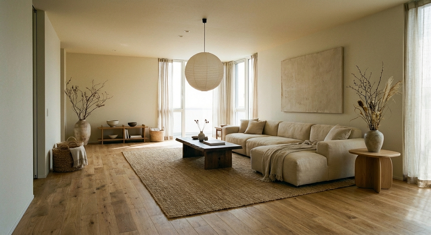
Gallery walls work because they create a single large visual statement from multiple smaller pieces, turning a blank wall into the room focal point. The key is treating the entire collection as one composition rather than individual frames. Successful gallery walls have a unifying element — consistent frame color, a shared color palette in the art, or a common theme — that reads as intentional curation. The arrangement style (grid, salon, or linear) sets the mood: grids feel modern and orderly, salon-style feels eclectic and collected, linear arrangements feel clean and contemporary.
Cách Đạt Được Phong Cách Này
- 1
Collect all pieces and lay them on the floor to plan the arrangement
- 2
Choose one frame color and stick with it — black, white, or natural wood
- 3
Start with the largest piece at eye level and build outward
- 4
Keep spacing consistent — 2-3 inches between all frames
- 5
Trace frames onto paper, cut out, and tape to the wall before hammering
- 6
Hang the center piece first, then work outward in all directions
Use matching frames in the same color for a cohesive gallery wall — mismatched frames only work if you are very intentional about it.
Thử Với AI
Planning a gallery wall layout is one of the most stressful design decisions. Layoutly AI lets you upload a photo of your wall and preview different gallery arrangements, frame styles, and spacing options before putting a single hole in the wall.
Câu Hỏi Thường Gặp
How many pieces should a gallery wall have?
A minimum of five pieces for impact — fewer looks sparse. For a full statement wall, 8-15 pieces works well. The key is having enough variety in size for visual interest while maintaining a unifying thread.
Do gallery wall frames need to match?
Not necessarily, but having a unifying element makes the wall cohesive. Matching frame color (all black, all white, all wood) is the easiest approach. If mixing frame styles, unify through a shared color palette in the artwork instead.
What is the ideal spacing between gallery wall frames?
Two to three inches between frames creates a tight, cohesive arrangement. More than four inches between frames makes the collection look disconnected. Consistency matters more than the exact measurement — keep spacing uniform throughout.
Sẵn Sàng Biến Đổi Căn Phòng Của Bạn?
Tải Layoutly và xem thiết kế này trong không gian của bạn chỉ trong vài giây.