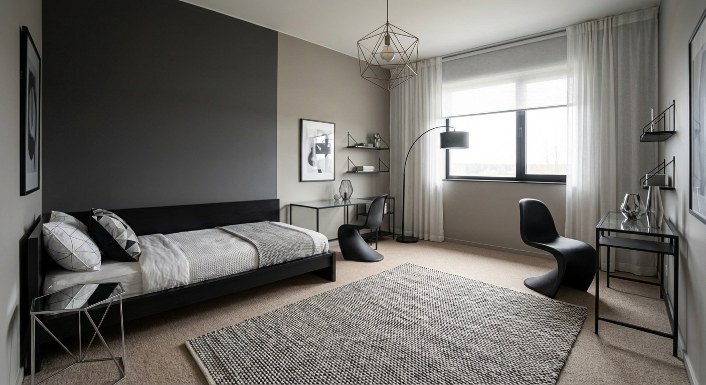
Pastels — Light, Airy Color That Lifts Every Room
Pastels are not just for nurseries. When used with intention, these soft, light-filled colors create sophisticated spaces that feel optimistic and serene.
$
Xem Sự Biến Đổi

Tải ảnh phòng của bạn lên ứng dụng để xem sự biến đổi thực tế
Bảng Màu
Tại Sao Phù Hợp
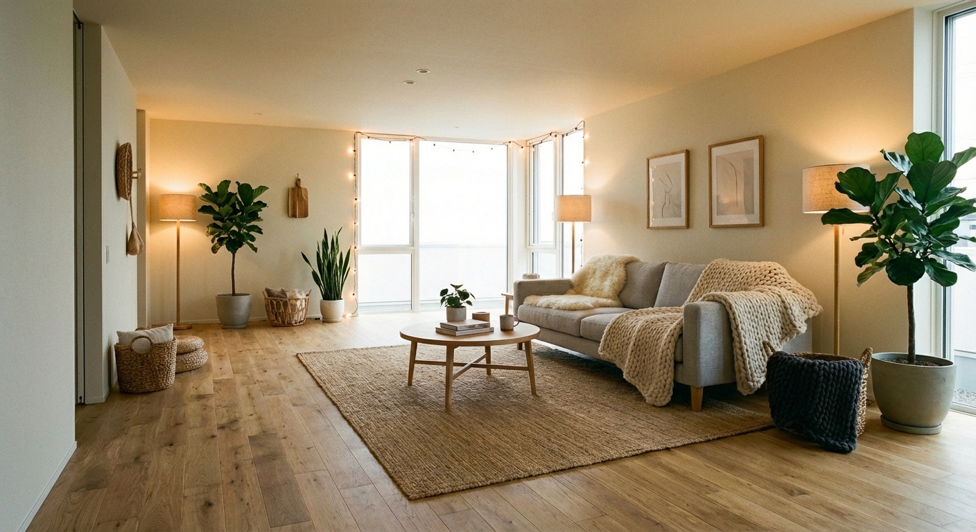
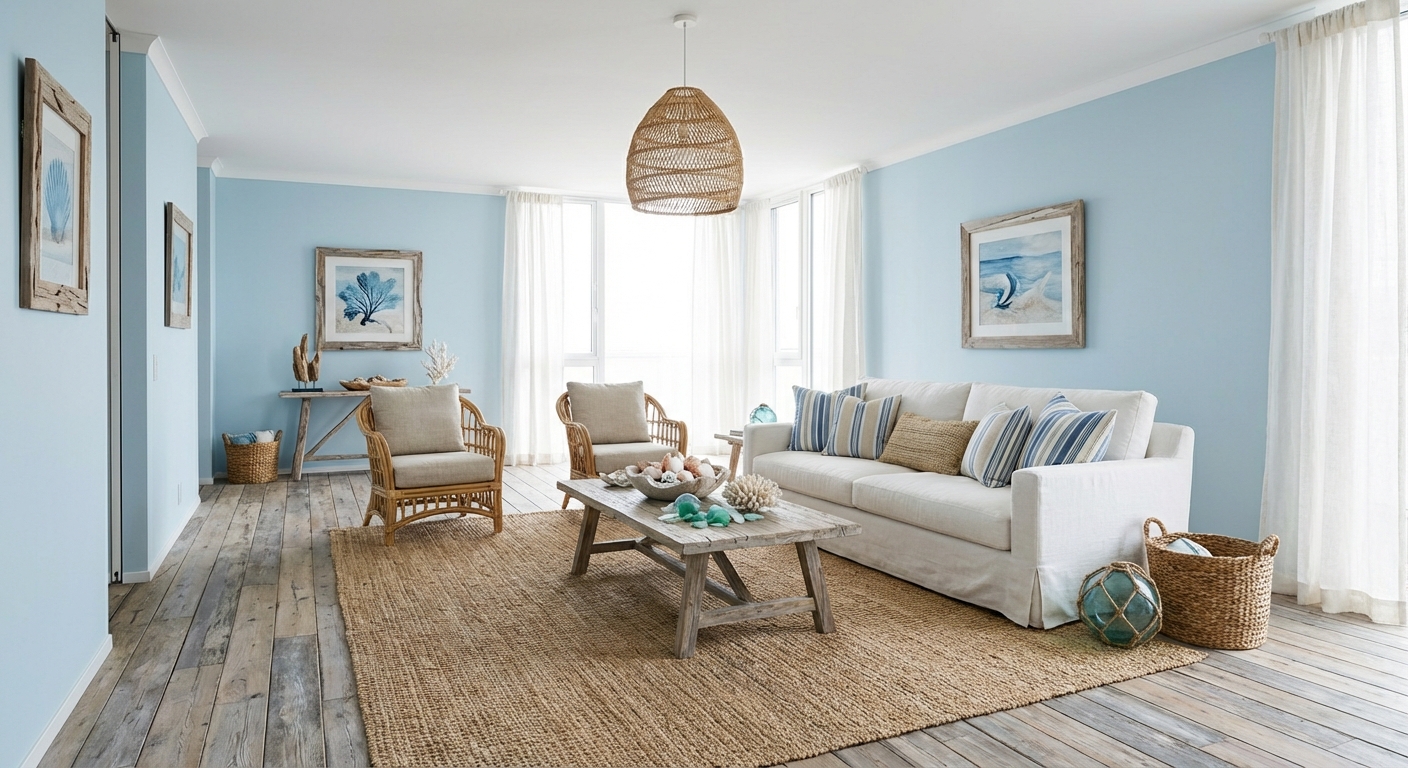
Pastels are colors mixed with white to reduce their saturation, resulting in soft tones that reflect more light than their deeper counterparts. This light-reflective quality makes pastel rooms feel brighter and more spacious. The gentle saturation also makes pastels inherently calming — they carry the personality of their parent hue (blue, green, pink, yellow) without the intensity. When combined, pastels create a palette reminiscent of spring gardens, watercolor paintings, and seaside sunsets — all associations that trigger positive emotional responses. The challenge is using pastels in a way that reads as sophisticated rather than childish, which comes down to proportion, pairing, and material choices.
Cách Đạt Được Phong Cách Này
- 1
Start with bright white walls and ceiling as the canvas
- 2
Choose two or three pastels from different color families
- 3
Introduce pastels through soft furnishings — pillows, throws, and rugs
- 4
Use white or light wood furniture to keep the look fresh
- 5
Add subtle metallic accents in gold or silver
- 6
Avoid mixing too many pastels — three is enough to keep it cohesive
Pastels need crisp white to pop — without enough white as a backdrop, they can look washed out instead of fresh.
Thử Với AI
Pastel shades can look dramatically different on a wall than on a paint chip — many read as nearly white in bright light or overly saturated in dim rooms. Layoutly AI lets you preview pastel wall colors, furniture, and textiles in your actual room to ensure the tone is visible but not overwhelming.
Câu Hỏi Thường Gặp
How do I use pastels without looking childish?
Pair pastels with grounding elements: dark accents, metallic hardware, natural wood, and mature materials like marble and velvet. Choose muted, gray-toned pastels rather than candy-bright versions. Using just one or two pastel shades with plenty of neutral prevents the sweet overload.
What pastel combinations work best together?
Analogous pairs are safest: soft pink and lavender, mint and pale blue, or peach and butter yellow. Complementary pairs add more interest: powder blue and blush pink, or soft green and pale coral. Limit yourself to two pastels per room for sophistication.
Do pastels work in dark rooms?
Pastels need light to read correctly. In dark rooms, they can appear dull or muddy. If your room is north-facing or receives limited light, choose warmer pastels (peach, butter) over cool ones (mint, lavender), and ensure adequate artificial lighting.
Sẵn Sàng Biến Đổi Căn Phòng Của Bạn?
Tải Layoutly và xem thiết kế này trong không gian của bạn chỉ trong vài giây.