Champagne & Ivory — Quiet Luxury That Catches the Light
This palette does not shout — it glows. Champagne metallics and ivory softness create rooms where every surface catches light and every moment feels elevated.
What is Champagne & Ivory Color Palette for Interiors?
This palette does not shout — it glows. Champagne metallics and ivory softness create rooms where every surface catches light and every moment feels elevated.
See the Transformation

Upload your room photo in the app to see your real transformation
Why It Works
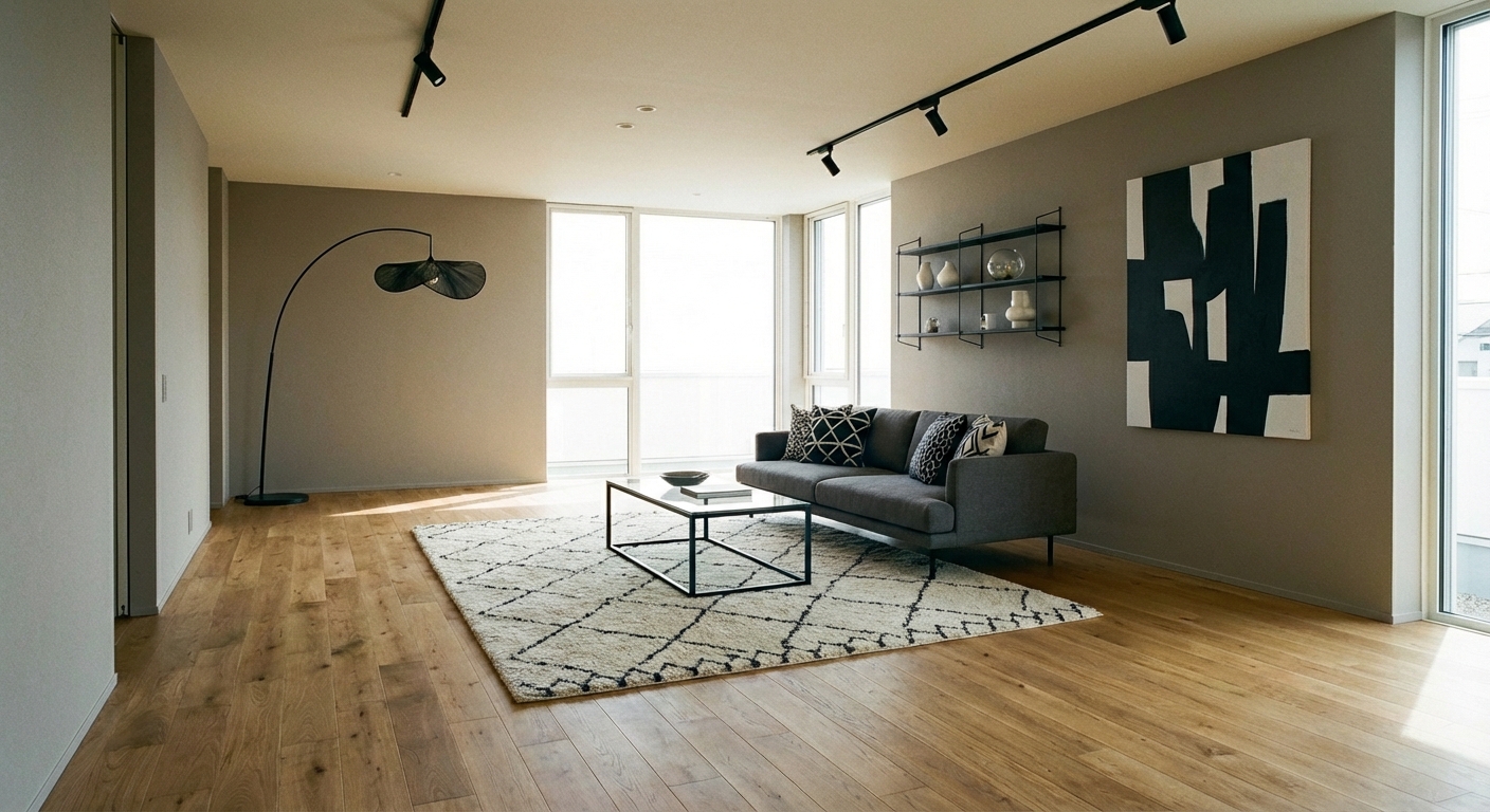
Champagne (#F7E7CE to #E8D5B5 range) is the most sophisticated neutral metallic — warmer than silver, subtler than gold, and more refined than bronze. Ivory (#FFFFF0 to #F5F1E4 range) is the warmest, softest white — it envelops a room in gentle warmth without the starkness of bright white. Together, they create a palette of luminous warmth that catches light from every angle. The combination embodies the "quiet luxury" movement — understated, material-rich design that communicates wealth through quality rather than logo or color. Champagne and ivory rooms feel like stepping into a luxury hotel lobby — beautiful, calm, and effortlessly elevated.
How to Achieve This Look
Use ivory (60%) on walls, upholstery, and the largest surfaces. Introduce champagne (30%) through metallic accents: a champagne-toned mirror frame, metallic thread in cushion fabric, a pearlescent tile backsplash, or warm-toned metallic hardware. Use warm white (10%) for crisp contrast. The key is layering tones — ivory walls, cream sofa, champagne cushions, and warm white trim create depth through monochromatic variation. Materials should be luxurious: silk, velvet, cashmere, marble, and pearl. Avoid matte textures that flatten the palette — the magic is in the sheen and light-catching quality of champagne surfaces.
Champagne and ivory create a tonal palette where subtle differences matter enormously. Intero AI previews how different ivory tones, metallic sheens, and light-catching surfaces create the luminous warmth in your specific room and lighting conditions.
"Saved thousands on interior design fees. The AI suggestions were spot-on."
— James R.
Frequently Asked Questions
Q1 Is champagne and ivory too monochromatic?
It can be if texture is absent. The palette relies entirely on material variation for interest: matte velvet beside glossy marble beside sheer silk beside textured linen. When every surface has a different texture and sheen, the monochromatic palette becomes rich and dynamic.
Q2 What accent colors work with champagne and ivory?
Soft blush adds romantic warmth. Warm taupe adds grounding depth. Warm metallic gold intensifies the champagne glow. Very small touches of deep brown or espresso provide necessary visual weight. Avoid cool colors (blue, gray, silver) which break the warm, luminous quality.
Q3 How do I keep an ivory room looking clean?
Choose performance fabrics (Crypton, Revolution) for upholstery. Use washable slipcovers on high-use pieces. Choose satin or semi-gloss wall paint for easy cleaning. Ivory rooms are actually easier to maintain than white — the warm tone hides minor imperfections that bright white reveals.
Related searches
These are the next pages people usually open while narrowing this design direction.
You Might Also Like
Ready to Transform Your Room?
Download Intero and see this design in your space in seconds.
No credit card. No signup. Just results.