How to Pick Paint Colors You Will Not Regret
Paint is the highest-impact, lowest-cost change in any room — but also the scariest to commit to. These steps eliminate the guesswork and common pitfalls.
What is How to Pick the Perfect Paint Colors for Any Room?
Paint is the highest-impact, lowest-cost change in any room — but also the scariest to commit to. These steps eliminate the guesswork and common pitfalls.
1/4
See the Transformation
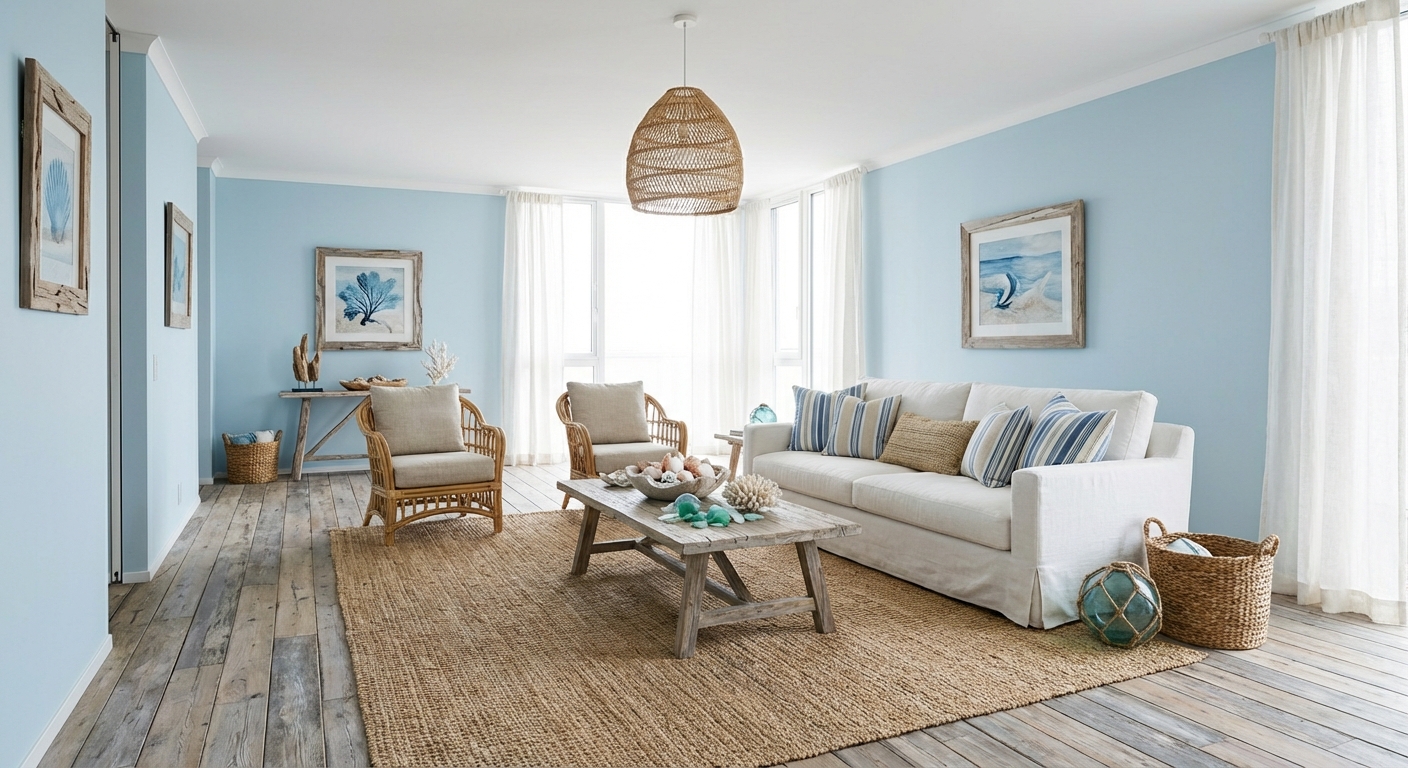

Upload your room photo in the app to see your real transformation
Color Palette
Click any color to copy hex code
Why It Works
Paint color selection fails most often because of undertones — the hidden hues within a color that only become visible on a large surface. A "gray" paint can read blue, green, or purple depending on its undertone and the room lighting. North-facing rooms receive cool blue light that amplifies blue undertones and deadens warm colors. South-facing rooms get warm yellow light that enhances warm tones. Understanding this interaction between paint undertone and room light eliminates the most common paint regrets.
Best for
- people ready to test options on a real photo before buying
- anyone planning a real living room where conversation distance, TV glare, and traffic past the sofa matter more than Pinterest perfection
- projects already thinking about paint, lighting and needing a coherent layout
Skip if
- you will not address conversation distance and only want a filter look
- you refuse to remove anything and only add decor
Common mistakes
In a living room, “how” fails when you shopping object-by-object with no envelope decision. Details like paint, lighting only work if the plan respects conversation distance, TV glare, and traffic past the sofa. Another miss: pushing every seat against the walls and calling the empty middle “open”.
Decide this first
fix the primary seating pair and one clear path before decorative chairs. Lock a coherent material story instead of random catalog picks as a short list, then use Intero on a real photo so scale and light are honest before you spend.
How to Achieve This Look
- 1
Identify fixed elements you cannot change — floors, countertops, tile
- 2
Match undertones — warm floors need warm paint, cool floors need cool paint
- 3
Gather paint chips and narrow down to three to five finalists
- 4
Buy sample pots and paint large swatches on multiple walls
- 5
View samples at different times of day and under artificial light
- 6
Commit to the color that looks best in the room evening light
Layout & materials
Begin by determining your room light direction. North-facing rooms need paints with warm undertones to counteract cool light. South-facing rooms can handle cooler tones. Sample at least three colors: paint large swatches (at least 12x12 inches) on the wall and observe them at different times of day — morning light, midday, and evening with artificial lighting. Always compare against your fixed elements: flooring, countertops, and furniture you plan to keep. Choose a paint with the same undertone family as your fixed elements (warm with warm, cool with cool). When in doubt, greige (gray-beige) is the safest neutral because it works in both warm and cool light.
Always test paint with a large 12x12 inch sample on at least two walls — colors look completely different on north-facing vs south-facing walls.
Intero AI removes the guesswork from paint selection. Upload your room photo and preview any paint color on your actual walls — seeing how it looks with your specific furniture, flooring, and lighting conditions before you buy a single sample.
Frequently Asked Questions
Q1 How do I identify paint undertones?
Hold the paint chip against a pure white sheet of paper. The undertone becomes visible by contrast — you will see whether the "gray" leans blue, green, or purple. Another trick: look at the darkest shade on the paint strip. The undertone is most visible in the darkest version.
Q2 How many paint samples should I test?
Test at least three colors in large swatches (12x12 inches minimum) on the wall. Observe them at morning, midday, and evening light. Small paint chips are unreliable because colors shift dramatically between a 2-inch chip and an entire wall.
Q3 What is the safest paint color if I cannot decide?
Benjamin Moore White Dove or Sherwin-Williams Agreeable Gray are widely considered the safest choices. Both are warm neutrals that work in most lighting conditions and complement most furniture and flooring.
Related searches
These are the next pages people usually open while narrowing this design direction.
You Might Also Like
Design Guides You'll Love
Ready to See This Style in Your Room?
Download Intero and preview this design on your own room photo.
No credit card. No signup. Just results.
Scan to download
Point your phone camera at a code

