Lavender & Gray — Soft Sophistication for Serene Spaces
Cool and calming, lavender and gray create an ethereal palette that feels both modern and romantic — like twilight captured in a room.
What is Lavender & Gray Color Palette for Interiors?
Cool and calming, lavender and gray create an ethereal palette that feels both modern and romantic — like twilight captured in a room.
See the Transformation

Upload your room photo in the app to see your real transformation
Why It Works
Lavender (#B4A7D6 to #9B8FC2 range) and gray share cool undertones that make them natural partners. Lavender adds just enough color to lift gray from neutral into something special, while gray grounds lavender preventing it from feeling too sweet or juvenile. The combination is inherently calming — lavender has documented stress-reducing properties (the essential oil is used in aromatherapy for precisely this reason), and gray provides a stable, quiet backdrop. The palette reads as sophisticated in living spaces, romantic in bedrooms, and unexpectedly chic in bathrooms. Unlike bolder purples, lavender works as a near-neutral, making it versatile enough for large surfaces without overwhelming a room.
How to Achieve This Look
Use medium gray as your dominant neutral (60%) on walls or large furniture. Introduce lavender at the 30% level through upholstery, bedding, curtains, or an accent wall. White or very pale gray serves as the brightening element (10%). The key to sophistication is choosing muted, gray-toned lavender rather than bright purple — the difference between a grown-up palette and a child bedroom. Materials should be soft and textural: velvet in lavender, linen in gray, silk-blend cushions, and marble with gray veining. Metallic accents should be silver, chrome, or brushed nickel to complement the cool tones — avoid brass and gold, which create a warm-cool tension that can feel unsettled.
Purple tones are tricky — what looks lavender on a paint chip can read as pink, gray, or even blue on a wall depending on lighting. Intero AI lets you preview lavender and gray combinations in your room with your specific light, ensuring the purple tone reads as intended.
"Saved thousands on interior design fees. The AI suggestions were spot-on."
— James R.
Frequently Asked Questions
Q1 Is lavender too feminine for a shared space?
When paired with gray, lavender reads as sophisticated rather than feminine. The key is choosing lavender with gray or blue undertones rather than pink undertones. Charcoal accents, natural wood, and structured furniture balance any softness. Many high-end hotels use lavender-gray palettes in gender-neutral spaces.
Q2 What other colors work with lavender and gray?
Soft green (sage or eucalyptus) adds natural freshness. White brightens the palette. Deep plum provides depth as a darker accent. Blush pink creates a romantic extension. Avoid warm tones (orange, terracotta) which clash with the cool foundation.
Q3 Which rooms suit lavender and gray best?
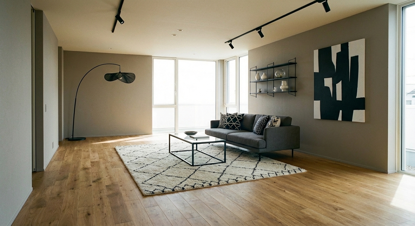
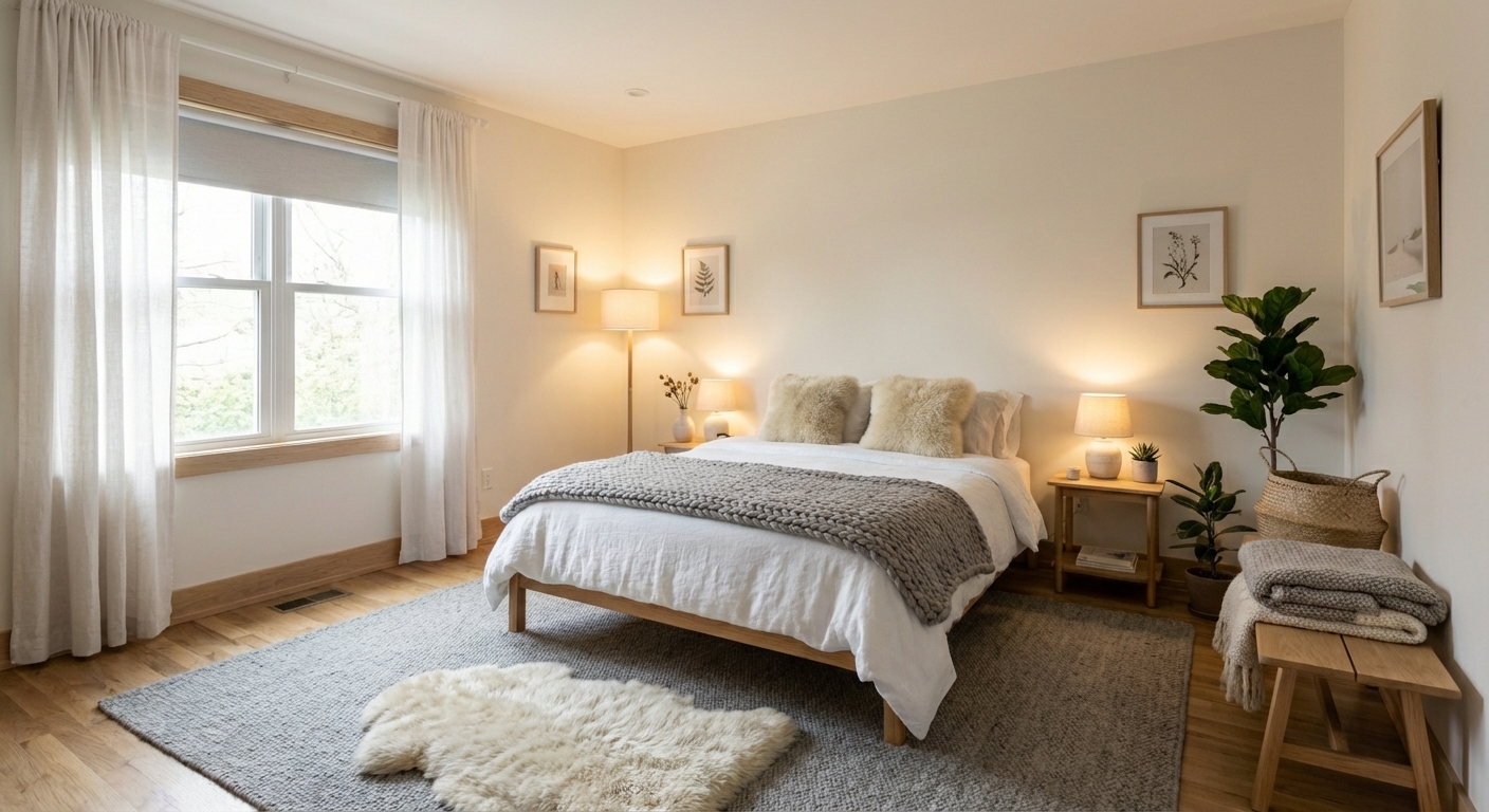
Bedrooms are the most natural fit — the calming properties promote rest. Bathrooms create a spa-like atmosphere with lavender and gray tile. Living rooms work with gray-dominant proportions and lavender accents. The palette can feel cold in kitchens without warm wood to balance it.
Related searches
These are the next pages people usually open while narrowing this design direction.
Ready to Transform Your Room?
Download Intero and see this design in your space in seconds.
No credit card. No signup. Just results.