Teal & Coral — Vibrant Complementary Color Done Right
Opposite on the color wheel and magnetic in combination, teal and coral create interiors that feel energetic, joyful, and beautifully balanced.
What is Teal & Coral Color Scheme for Interiors?
Opposite on the color wheel and magnetic in combination, teal and coral create interiors that feel energetic, joyful, and beautifully balanced.
See the Transformation

Upload your room photo in the app to see your real transformation
Why It Works
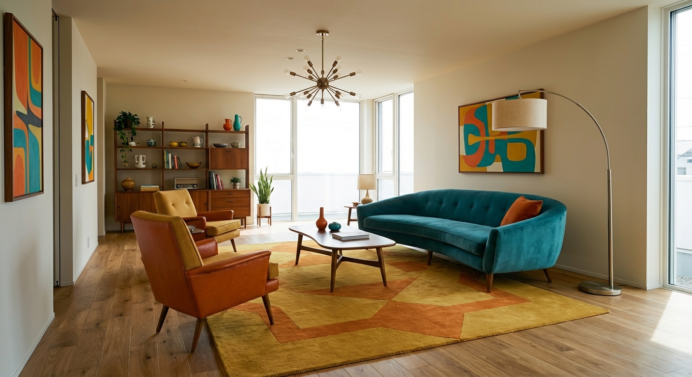
Teal (#008080 to #367588 range) and coral (#FF7F50 to #E8725C range) are near-complementary colors — they sit across from each other on the color wheel, creating maximum visual energy when combined. The pairing works because teal provides cool, calming depth while coral adds warm, optimistic energy. Neither overwhelms the other when balanced properly. The combination feels tropical, joyful, and modern without the severity of colder complementary pairs like blue-and-orange. Teal and coral also work because both are "muted brights" — vibrant enough to create impact but softened enough to feel livable, unlike their harsher parents (cyan and red).
How to Achieve This Look
Choose one color to lead and let the other support. The more livable approach: teal-dominant with coral accents. Use teal on an accent wall, furniture, or curtains (the 30% color), with a neutral base of white or warm cream (60%), and coral in pillows, art, ceramics, and small accessories (10%). For a bolder approach, reverse the ratio or increase both — but always keep a generous neutral buffer to prevent visual fatigue. Gold or brass metallics bridge the warm-cool gap beautifully. Natural wood adds grounding warmth. Avoid using both colors in their brightest saturation simultaneously — let one be slightly more muted while the other pops.
Complementary color schemes require precise proportions — too much of either teal or coral creates imbalance. Intero AI lets you test different teal-coral ratios in your room, adjusting which leads and which accents until you find the balance that feels energetic but livable.
"Saved thousands on interior design fees. The AI suggestions were spot-on."
— James R.
Frequently Asked Questions
Q1 Will teal and coral look too bright for a living room?
Not when one is dominant and the other accents. A teal velvet sofa with coral cushions against warm white walls feels sophisticated. The key is letting the neutral base (cream, white, warm gray) take up most of the visual space, with teal and coral as punctuation rather than the whole sentence.
Q2 What design styles suit teal and coral?
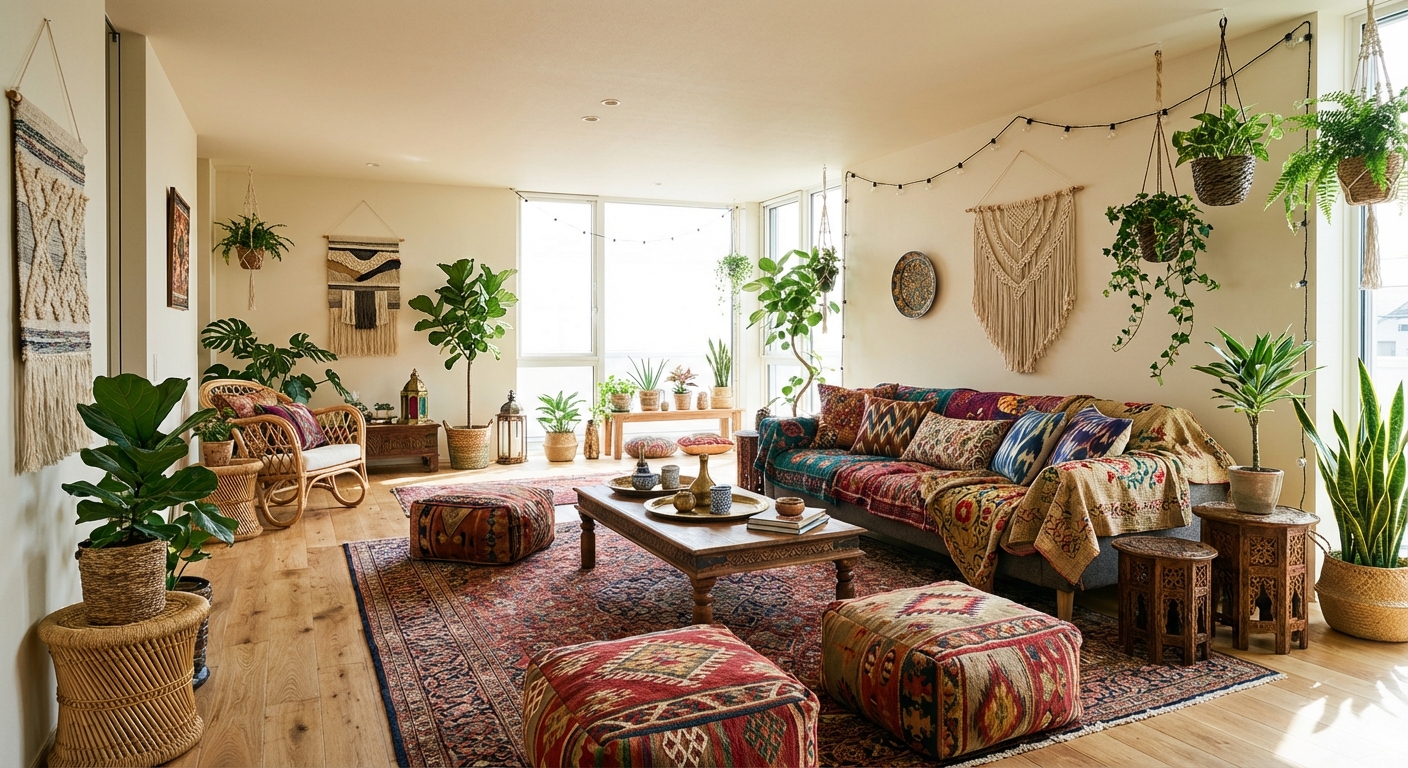
Mid-century modern (these are signature MCM accent colors), bohemian (both colors appear in global textiles), coastal with a twist, and maximalist rooms all embrace this pairing. The combination is too vibrant for strict minimalism or traditional design but works in any style that welcomes color.
Q3 What neutral best supports teal and coral?
Warm white or cream is the safest neutral base — it complements both the cool teal and warm coral. Warm gray works for a moodier feel. Avoid cool gray, which makes coral look out of place. Natural wood and rattan add warmth that bridges the two bold tones.
Related searches
These are the next pages people usually open while narrowing this design direction.
Ready to Transform Your Room?
Download Intero and see this design in your space in seconds.
No credit card. No signup. Just results.