Blush Pink & Sage — A Garden-Inspired Palette That Feels Grown Up
Soft pink and muted green are nature natural pairing — rose petals against leaves. This palette brings that organic harmony indoors for rooms that feel fresh and romantic without being saccharine.
What is Blush Pink & Sage Color Palette for Interiors?
Soft pink and muted green are nature natural pairing — rose petals against leaves. This palette brings that organic harmony indoors for rooms that feel fresh and romantic without being saccharine.
See the Transformation
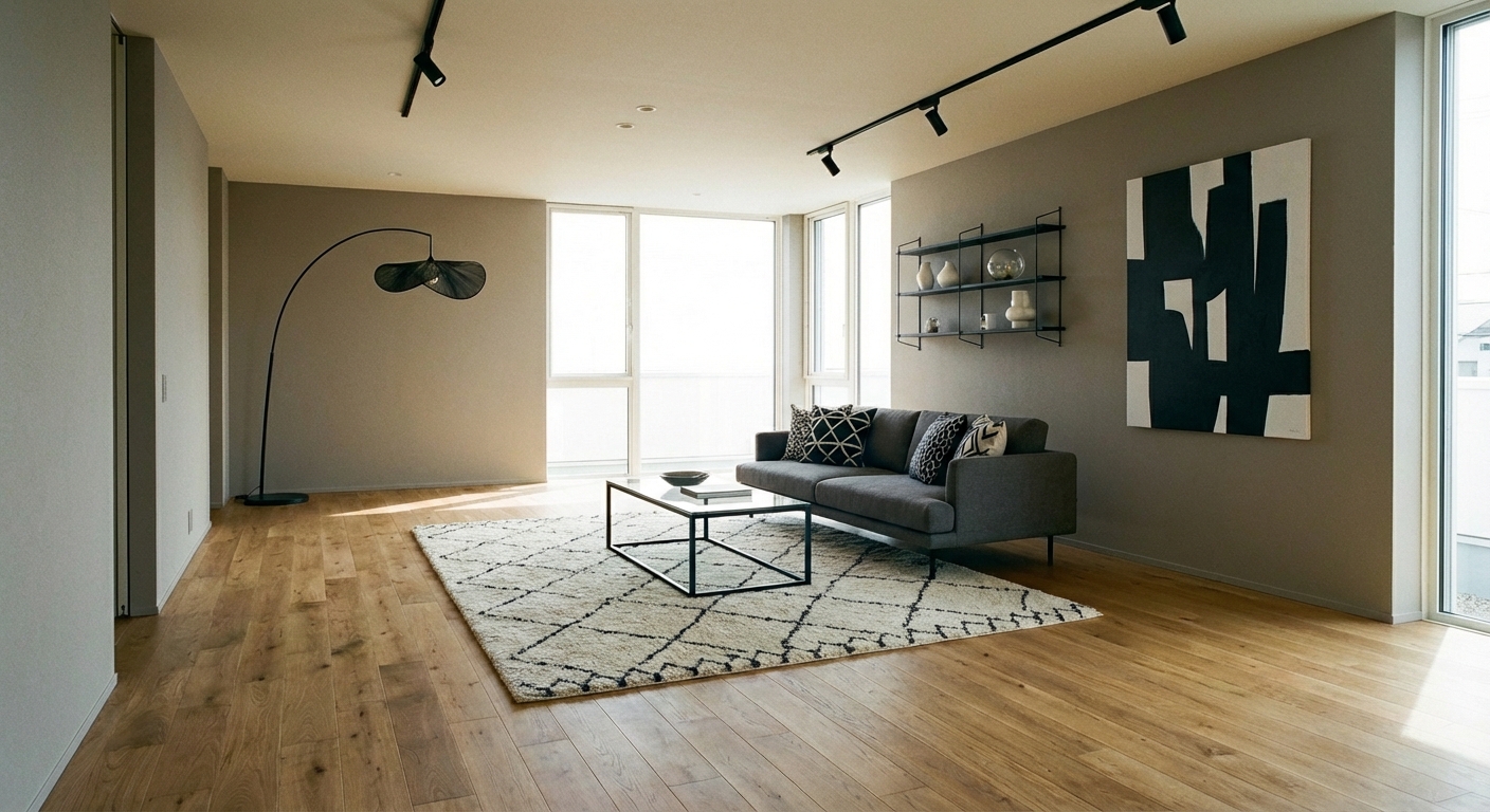

Upload your room photo in the app to see your real transformation
Why It Works
Blush pink (#E8C4C4 to #D4A5A5 range) and sage green (#B2BEB5 to #8A9A7B range) are complementary on the color wheel, creating natural visual harmony. Pink brings warmth and softness; sage brings coolness and calm. Together they prevent the extremes that each color risks alone — pink never gets too sweet when grounded by sage, and sage never gets too cold when warmed by pink. The combination references the natural world (roses, peonies, garden greenery), which gives it an organic quality that feels sophisticated rather than themed. The palette works across seasons and styles, from Scandinavian simplicity to romantic cottage to modern organic.
Best for
- people ready to test options on a real photo before buying
- anyone planning a real living room where conversation distance, TV glare, and traffic past the sofa matter more than Pinterest perfection
- projects already thinking about curtains, linen and needing a coherent layout
Skip if
- you will not address conversation distance and only want a filter look
- you refuse to remove anything and only add decor
Common mistakes
People pin blush living room ideas and then shopping object-by-object with no envelope decision. Details like curtains, linen only work if the plan respects conversation distance, TV glare, and traffic past the sofa. Another miss: pushing every seat against the walls and calling the empty middle “open”.
Decide this first
fix the primary seating pair and one clear path before decorative chairs. Lock a coherent material story instead of random catalog picks as a short list, then use Intero on a real photo so scale and light are honest before you spend.
How to Achieve This Look
Use sage green as the dominant color (60%) — on walls, large upholstery, or major textiles. Introduce blush pink at the 30% level through accent furniture, bedding, curtains, or cushions. Reserve white or cream (10%) as the brightening neutral. The key is choosing muted, gray-toned versions of both colors rather than saturated pink or bright green. Materials should be soft and natural: linen, cotton, wool, and matte ceramics. Metallic accents should be warm — brushed gold or brass complement both colors beautifully. Avoid silver or chrome, which cool down the blush tones. Add greenery (real plants) to reinforce the sage palette naturally.
Pink tones are notoriously tricky — they shift between blush, mauve, and bubble gum depending on lighting. Intero AI lets you preview the exact blush-sage balance in your room with your specific light conditions, ensuring the palette reads as sophisticated rather than juvenile.
Frequently Asked Questions
Q1 Is blush pink too feminine for a shared space?
Not when paired with sage green and warm neutrals. Sage grounds the pink and prevents it from reading as gendered. The combination reads as "garden" rather than "girls room." Adding natural wood tones and brass accents further balances the palette for universal appeal.
Q2 Which rooms suit blush and sage best?
Bedrooms are the most natural fit — the calming, romantic quality promotes rest. Living rooms work well with sage-dominant proportions and blush accents. Nurseries and guest rooms also benefit from the gentle palette. Kitchens and bathrooms can use sage as the dominant color with blush accents in textiles.
Q3 What neutrals pair with blush and sage?
Warm cream, soft white (not bright white), and warm taupe provide the best neutral bridges. Warm wood tones (oak, birch) complement both colors. Avoid cool gray, which can make the palette feel disconnected. The warmth of the neutrals should match the warmth of the blush.
Related searches
These are the next pages people usually open while narrowing this design direction.
You Might Also Like
Ready to See This Style in Your Room?
Download Intero and preview this design on your own room photo.
No credit card. No signup. Just results.
Scan to download
Point your phone camera at a code

