Your Wood Tones Are Fighting Each Other — Here's the Peace Treaty
Orange oak floors, espresso cabinets, and honey pine furniture in one room creates visual chaos. These techniques harmonize mismatched wood without replacing anything.
What is Clashing Wood Tones? How to Harmonize Mismatched Wood?
Orange oak floors, espresso cabinets, and honey pine furniture in one room creates visual chaos. These techniques harmonize mismatched wood without replacing anything.
See the Transformation
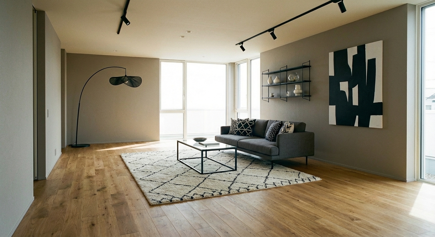

Upload your room photo in the app to see your real transformation
Why It Works
Wood tones clash when they sit on opposite sides of the warm-cool spectrum without a bridge between them. Orange-toned oak next to gray-washed ash creates dissonance because the eye reads them as from different design worlds. But multiple wood tones can coexist beautifully when they share an undertone family — warm with warm, cool with cool — or when a bridging element connects them. A walnut-toned accessory can bridge honey oak floors and espresso cabinets because walnut sits between them on the warmth spectrum. The goal is not matching; it is creating a gradient that the eye reads as intentional.
Best for
- people ready to test options on a real photo before buying
- anyone planning a real living room where conversation distance, TV glare, and traffic past the sofa matter more than Pinterest perfection
- projects already thinking about oak, walnut, cabinets and needing a coherent layout
Skip if
- you will not address conversation distance and only want a filter look
- you need the room finished tomorrow with zero test fits
Common mistakes
In a living room, “clashing” fails when you shopping object-by-object with no envelope decision. Details like oak, walnut, cabinets only work if the plan respects conversation distance, TV glare, and traffic past the sofa. Another miss: pushing every seat against the walls and calling the empty middle “open”.
Decide this first
fix the primary seating pair and one clear path before decorative chairs. Lock a coherent material story instead of random catalog picks as a short list, then use Intero on a real photo so scale and light are honest before you spend.
How to Achieve This Look
First, identify the undertone of each wood: hold a piece of white paper next to the surface — warm woods lean yellow, orange, or red; cool woods lean gray, purple, or ashy. If your woods clash across the warm-cool divide, introduce a bridge wood that contains both tones — walnut is the universal mediator. Limit visible wood tones to three maximum. Use the 60-30-10 approach: one dominant wood tone (usually flooring), one secondary (large furniture), and one accent (accessories). Ground everything with a large neutral-toned rug that gives the eye a rest between conflicting surfaces. Black or matte metal accents create visual pauses that separate wood tones.
Intero AI lets you preview how introducing a bridging wood tone, a neutral rug, or strategic accessories changes the harmony of your room. Upload a photo and test different approaches to unify your existing wood tones without the expense of replacing flooring or furniture.
Frequently Asked Questions
Q1 Can you mix light and dark wood in the same room?
Yes — contrast is actually more pleasing than matching when done intentionally. The key is ensuring both woods share the same undertone family (both warm or both cool) and distributing them evenly so one does not feel like an accident.
Q2 What is the easiest way to fix clashing wood tones?
Add a large neutral rug between the conflicting surfaces — it creates a visual buffer. Then introduce black or metal accents (lamp bases, frames, hardware) that act as punctuation marks between the wood tones, giving the eye clear stopping points.
Q3 Should all wood furniture in a room match?
No — matching furniture sets look dated and catalog-like. The modern approach is mixing two or three wood tones within the same undertone family. A room with honey oak floors, a walnut table, and a light maple shelf looks collected and interesting.
Related searches
These are the next pages people usually open while narrowing this design direction.
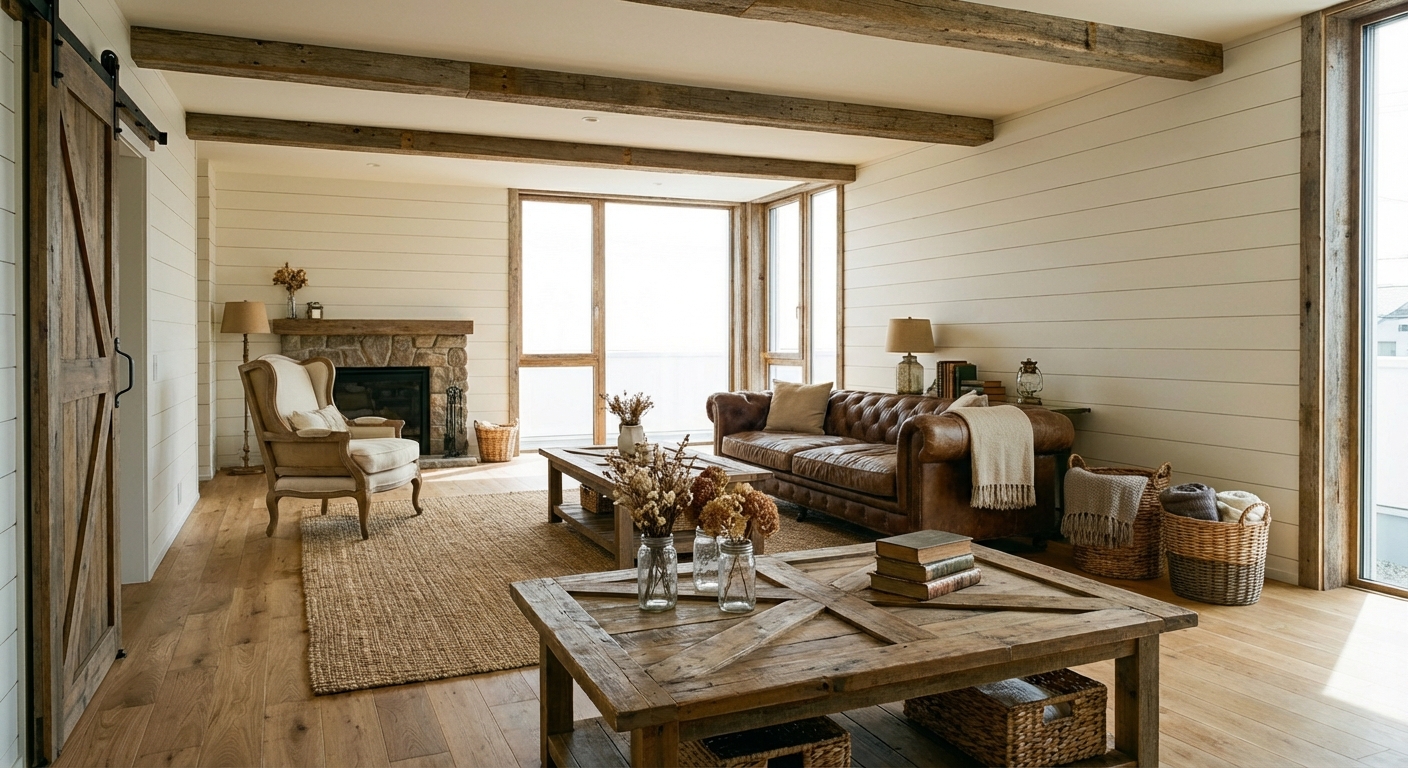
Ready to See This Style in Your Room?
Download Intero and preview this design on your own room photo.
No credit card. No signup. Just results.
Scan to download
Point your phone camera at a code

