Sky Blue & White — Clear Skies and Open Spaces in Every Room
The most universally calming color combination in nature — blue sky above, white clouds — translated into interiors that feel fresh, open, and endlessly inviting.
What is Sky Blue & White Color Palette for Interiors?
The most universally calming color combination in nature — blue sky above, white clouds — translated into interiors that feel fresh, open, and endlessly inviting.
See the Transformation
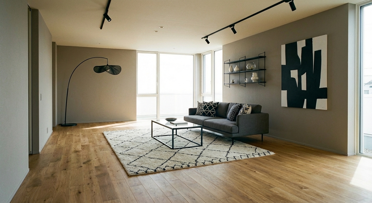

Upload your room photo in the app to see your real transformation
Why It Works
Blue and white is the most enduring color combination in interior design history — from Delft pottery to Greek island architecture to classic American coastal homes. Sky blue (#87CEEB to #6FB1D6 range) evokes open sky, calm water, and summer afternoons. White provides the crispness that keeps blue fresh and prevents it from feeling heavy. The combination triggers the same neurological calm as looking at the sky or ocean — the brain associates these colors with open space and relaxation. The palette transcends specific styles — it works in coastal, traditional, Hamptons, Mediterranean, Scandinavian, and contemporary settings with equal ease.
Best for
- people ready to test options on a real photo before buying
- anyone planning a real living room where conversation distance, TV glare, and traffic past the sofa matter more than Pinterest perfection
- projects already thinking about island, curtains, rug and needing a coherent layout
Skip if
- you will not address conversation distance and only want a filter look
- you refuse to remove anything and only add decor
Common mistakes
The usual sky living room miss is shopping object-by-object with no envelope decision. Details like island, curtains, rug only work if the plan respects conversation distance, TV glare, and traffic past the sofa. Another miss: pushing every seat against the walls and calling the empty middle “open”.
Decide this first
fix the primary seating pair and one clear path before decorative chairs. Lock a coherent material story instead of random catalog picks as a short list, then use Intero on a real photo so scale and light are honest before you spend.
How to Achieve This Look
Use white as the dominant color (60-70%) — on walls, ceilings, and the largest furniture piece. Introduce sky blue at the 30-40% level through upholstery, curtains, a statement rug, or an accent wall. The classic approach layers multiple shades of blue: a sky blue sofa, navy throw pillows, and pale blue curtains create depth within the blue family. Materials should be fresh and natural: cotton, linen, light wood, and wicker. Avoid heavy or dark materials that conflict with the airy quality. Metallic accents should be cool — polished nickel, chrome, or silver. Warm metals (brass, gold) work if the blue leans toward periwinkle or French blue rather than true sky blue.
Blue reads differently depending on lighting and surrounding colors — a sky blue can shift toward gray, purple, or green depending on the room. Intero AI shows you exactly how blue-and-white combinations will read in your specific space and light conditions.
Frequently Asked Questions
Q1 Is blue and white too cold for a living room?
Sky blue with warm white (cream-based) creates a warmer palette than true blue with bright white. Add natural wood tones (light oak, rattan) and warm textiles (a cream wool throw, wicker baskets) to introduce warmth without breaking the blue-white scheme.
Q2 What blue shades work best with white?
Sky blue, powder blue, and cornflower blue are the easiest to live with — they are soft enough for large surfaces. French blue and periwinkle add warmth. Avoid neon or electric blues, which are energizing rather than calming. Test paint samples in your specific lighting before committing.
Q3 How do I prevent blue and white from looking too nautical?
Avoid literal coastal motifs (anchors, stripes, ships). Use solid blue fabrics and natural textures instead. Mix in warm wood, greenery, and warm-toned art. A blue-and-white room becomes nautical only when themed accessories make it so — the color combination itself is universal.
Related searches
These are the next pages people usually open while narrowing this design direction.
Ready to See This Style in Your Room?
Download Intero and preview this design on your own room photo.
No credit card. No signup. Just results.
Scan to download
Point your phone camera at a code

