Slate Blue & Wood — Calm Skies Grounded by Warm Timber
Slate blue is the thinking person blue — quiet, sophisticated, and never trendy. Paired with natural wood, it creates rooms that feel intelligent and warm simultaneously.
What is Slate Blue & Natural Wood Color Scheme?
Slate blue is the thinking person blue — quiet, sophisticated, and never trendy. Paired with natural wood, it creates rooms that feel intelligent and warm simultaneously.
See the Transformation
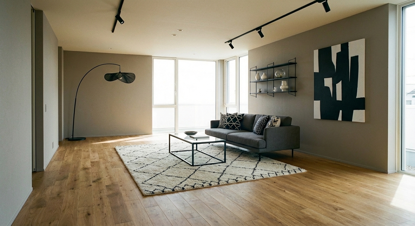

Upload your room photo in the app to see your real transformation
Why It Works
Slate blue (#6D7B8D to #708090 range) is the most versatile muted blue — it carries enough blue to feel colored but enough gray to feel neutral. It never reads as childish (unlike sky blue), loud (unlike royal blue), or moody (unlike navy). Natural wood — oak, walnut, pine, or teak — adds the organic warmth that prevents slate blue from feeling cold or institutional. The combination appears throughout Scandinavian and Japanese design traditions, both cultures that value the harmony between cool restraint and natural warmth. Slate blue and wood is the palette of calm intelligence — ideal for home offices, libraries, living rooms, and bedrooms where focused relaxation is the goal.
Best for
- people ready to test options on a real photo before buying
- anyone planning a real living room where conversation distance, TV glare, and traffic past the sofa matter more than Pinterest perfection
- projects already thinking about oak, walnut, sofa and needing a coherent layout
Skip if
- you will not address conversation distance and only want a filter look
- you refuse to remove anything and only add decor
Common mistakes
People pin slate living room ideas and then shopping object-by-object with no envelope decision. Details like oak, walnut, sofa only work if the plan respects conversation distance, TV glare, and traffic past the sofa. Another miss: pushing every seat against the walls and calling the empty middle “open”.
Decide this first
fix the primary seating pair and one clear path before decorative chairs. Lock a coherent material story instead of random catalog picks as a short list, then use Intero on a real photo so scale and light are honest before you spend.
How to Achieve This Look
Use slate blue as a significant presence (40%) — on walls, a large sofa, or curtains. Introduce natural wood (30%) through flooring, furniture, and accessories in warm tones (oak, walnut, or teak). Use white or off-white (30%) for brightness and visual relief. The slate blue should be muted and gray-toned — avoid vivid blue, which will overpower the natural wood. Materials should be honest and natural: solid wood (not laminate), linen and cotton textiles, matte ceramics, and natural stone. Metallic accents in matte black or warm brass complement the palette without adding visual noise.
Slate blue varies significantly between paint brands and lighting conditions — it can lean blue, gray, or even green depending on context. Intero AI previews your exact slate blue tone against your room wood tones and light to ensure the cool-warm balance works harmoniously.
Frequently Asked Questions
Q1 What wood tones pair best with slate blue?
Warm mid-tones — oak, walnut, and teak — create the best contrast and warmth. Light blonde wood (maple, birch) works for a Scandinavian feel. Dark espresso wood can make the palette feel heavy unless the room has abundant natural light. Avoid orange-toned pine, which clashes with slate blue cool gray undertone.
Q2 Is slate blue a good wall color?
Excellent — it is dark enough to create atmosphere but light enough to avoid making rooms feel small. It provides a sophisticated backdrop for art and wood furniture. Test in your specific room: north-facing rooms may push slate blue toward gray, while south-facing rooms bring out the blue.
Q3 What accent colors work with slate blue and wood?
Warm cream and white are essential. Soft mustard or amber add a warm accent pop. Rust and terracotta complement the earthy wood tones. Olive green creates a nature-inspired triad. Avoid bright colors that compete with the quiet sophistication of the palette.
Related searches
These are the next pages people usually open while narrowing this design direction.
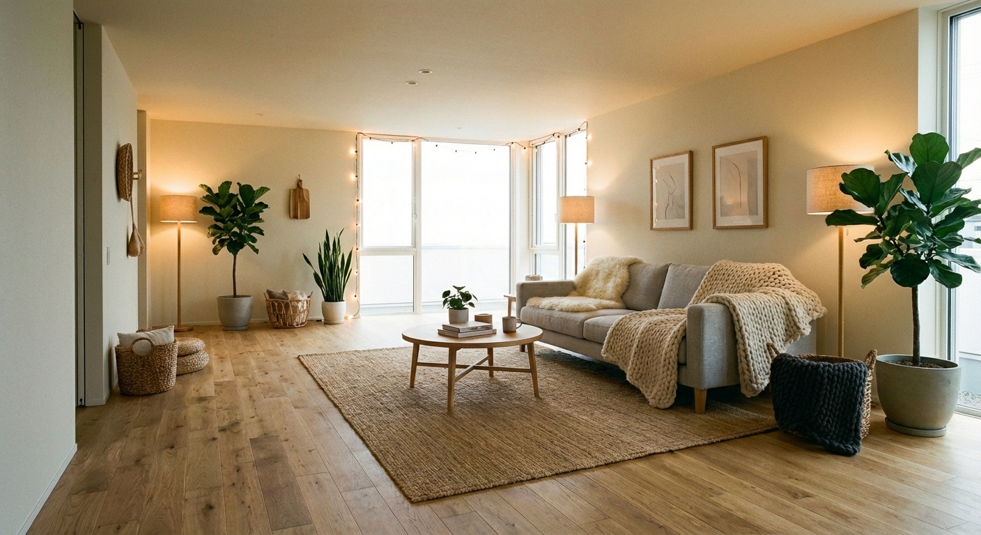
Ready to See This Style in Your Room?
Download Intero and preview this design on your own room photo.
No credit card. No signup. Just results.
Scan to download
Point your phone camera at a code

