Burnt Orange — The Warm Retro Tone Making a Serious Comeback
Neither red nor yellow, burnt orange sits at the warmest point of the color wheel. It brings mid-century warmth and earthy sophistication to any space it touches.
What is Burnt Orange Color Palette for Interiors?
Neither red nor yellow, burnt orange sits at the warmest point of the color wheel. It brings mid-century warmth and earthy sophistication to any space it touches.
See the Transformation
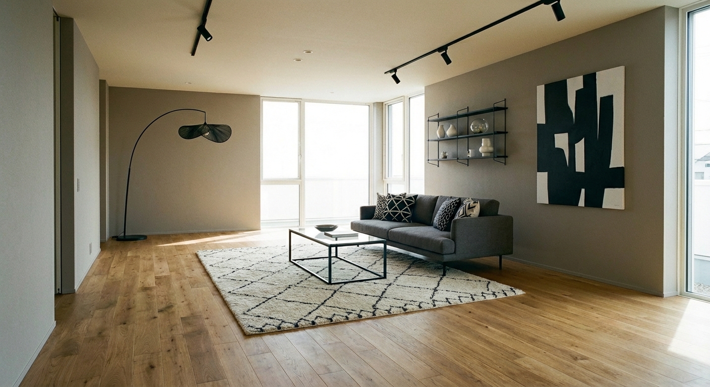

Upload your room photo in the app to see your real transformation
Why It Works
Burnt orange (#CC5500 to #BF5700 range) is the warm, muted cousin of bright orange — toned down with brown undertones that give it depth and sophistication. The color dominated 1970s interiors and faded from favor during the cool-toned decades that followed, but its current revival is driven by the broader warm-palette shift in design. Burnt orange works because it is one of the warmest colors available without the intensity of red. It creates visual warmth in any room, makes north-facing spaces feel sunny, and pairs naturally with the earth tones (olive, cream, warm brown) that define current design trends. The color carries strong associations with autumn, harvest, and fireside warmth, making it psychologically comforting in residential spaces.
Best for
- people ready to test options on a real photo before buying
- anyone planning a real living room where conversation distance, TV glare, and traffic past the sofa matter more than Pinterest perfection
- projects already thinking about sofa, rug and needing a coherent layout
Skip if
- you will not address conversation distance and only want a filter look
- you refuse to remove anything and only add decor
Common mistakes
In a living room, “burnt” fails when you shopping object-by-object with no envelope decision. Details like sofa, rug only work if the plan respects conversation distance, TV glare, and traffic past the sofa. Another miss: pushing every seat against the walls and calling the empty middle “open”.
Decide this first
fix the primary seating pair and one clear path before decorative chairs. Lock a coherent material story instead of random catalog picks as a short list, then use Intero on a real photo so scale and light are honest before you spend.
How to Achieve This Look
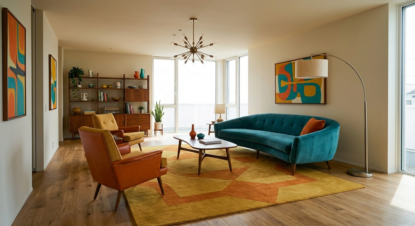
Use burnt orange at the 10-30% level — it is a powerful accent that can overwhelm when overused. A burnt orange accent wall, a velvet sofa, or a large rug makes a statement without dominating. Pair with cream and warm white as your neutral base — avoid cool whites, which clash with orange undertones. Supporting colors should be earthy: olive green, warm brown, camel, and charcoal. Metallic accents in brass and copper amplify the warmth. Materials with texture carry burnt orange well: velvet, boucle, woven wool, and leather. For a more subtle approach, introduce burnt orange through pottery, cushions, and a throw before committing to larger pieces.
Burnt orange can shift dramatically between bold and subtle depending on lighting and surrounding colors. Intero AI lets you preview burnt orange walls, furniture, and textiles in your room with your specific light to find the right shade and proportion before committing.
Frequently Asked Questions
Q1 Will burnt orange make my room look dated or 70s?
Not when styled with current materials. The 70s version was shag carpet and avocado appliances; the 2026 version is a boucle sofa in burnt orange against warm white walls with brass accents and natural wood. The color is the same — the context makes it contemporary.
Q2 What colors should I avoid pairing with burnt orange?
Cool gray is the main clash — it makes burnt orange look cheap. Bright blue can feel garish. Cool pastels (lavender, mint) create an uncomfortable temperature contrast. Stick to warm neutrals and earth tones for the most harmonious pairings.
Q3 Which rooms suit burnt orange best?
Living rooms and dining rooms benefit most from the warmth and conversation-encouraging quality. Bedrooms can use softer versions through textiles. Kitchens suit smaller doses — burnt orange ceramics or a backsplash. Home offices benefit from the energizing warmth.
Related searches
These are the next pages people usually open while narrowing this design direction.
Ready to See This Style in Your Room?
Download Intero and preview this design on your own room photo.
No credit card. No signup. Just results.
Scan to download
Point your phone camera at a code

