Charcoal & Rust — Industrial Warmth With Serious Edge
Dark gray absorbs light and creates drama. Rust radiates warmth and earthy energy. Together, they build rooms with gravitas that never feel cold.
What is Charcoal & Rust Color Scheme for Interiors?
Dark gray absorbs light and creates drama. Rust radiates warmth and earthy energy. Together, they build rooms with gravitas that never feel cold.
See the Transformation
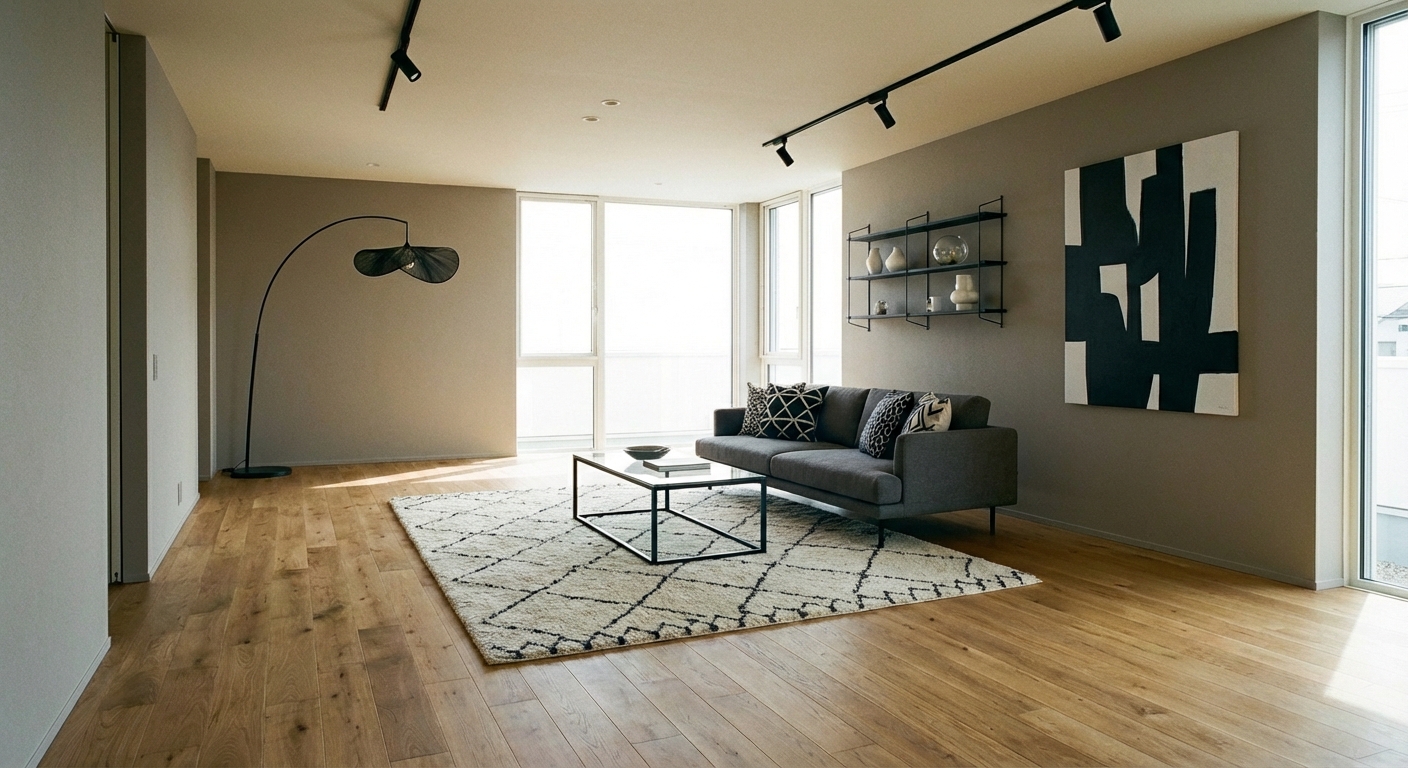

Upload your room photo in the app to see your real transformation
Why It Works
Charcoal (#36454F to #2C3E50 range) provides a dramatic, absorptive backdrop that makes everything placed against it appear more vivid and intentional. Rust (#B7410E to #A0522D range) is one of the warmest earth tones — it radiates the energy of fire and clay without the aggression of red. Together, they create the rare combination of dramatic and warm, masculine and inviting. The palette references natural materials (charcoal, iron, terracotta, clay) which gives it an organic authenticity that feels timeless rather than trendy. It works particularly well in rooms that need gravitas: living rooms, studies, dining rooms, and master bedrooms.
Best for
- people ready to test options on a real photo before buying
- anyone planning a real living room where conversation distance, TV glare, and traffic past the sofa matter more than Pinterest perfection
- projects already thinking about rug, lighting and needing a coherent layout
Skip if
- you will not address conversation distance and only want a filter look
- you refuse to remove anything and only add decor
Common mistakes
The usual charcoal living room miss is shopping object-by-object with no envelope decision. Details like rug, lighting only work if the plan respects conversation distance, TV glare, and traffic past the sofa. Another miss: pushing every seat against the walls and calling the empty middle “open”.
Decide this first
fix the primary seating pair and one clear path before decorative chairs. Lock a coherent material story instead of random catalog picks as a short list, then use Intero on a real photo so scale and light are honest before you spend.
How to Achieve This Look
Use charcoal as the envelope — walls, large furniture, or the floor — to establish the dramatic base (60%). Introduce rust at the 30% level through accent furniture, cushions, a statement rug, or terracotta accessories. Use warm cream or natural wood (10%) as the relief color to prevent the palette from feeling too heavy. Materials should have weight and texture: leather, wool, brushed metals, and matte ceramics. Lighting is critical in a charcoal room — layer warm-toned sources (2700K bulbs) at multiple heights to prevent dark corners. Metallic accents should be warm: aged brass, copper, and bronze complement both charcoal and rust beautifully.
Dark palettes are the hardest to predict — a room can feel dramatic or depressing depending on lighting and proportion. Intero AI lets you test charcoal wall colors and rust accent ratios in your specific room to find the balance that feels moody and warm, not cave-like.
Frequently Asked Questions
Q1 Will charcoal walls make my room feel small?
Dark walls do not necessarily shrink a room — they can create the illusion of depth, making walls recede. The key is warm-toned lighting at multiple levels and at least one light-toned large surface (a cream sofa, light rug, or natural wood floor) to provide visual relief.
Q2 What accent colors work with charcoal and rust?
Warm cream provides essential brightness. Cognac leather adds a related warm brown. Aged brass brings metallic warmth. For a bolder accent, deep terracotta or burnt sienna intensifies the rust family. Avoid cool tones (blue, silver) which create a temperature clash.
Q3 Is this palette too dark for a bedroom?
Charcoal bedrooms can be incredibly luxurious — the darkness promotes sleep and the rust accents add warmth. Use white bedding as the visual relief and add warm lighting (table lamps on nightstands, not overhead). Many boutique hotels use this exact palette for its cocooning, sleep-promoting quality.
Related searches
These are the next pages people usually open while narrowing this design direction.
You Might Also Like
Ready to See This Style in Your Room?
Download Intero and preview this design on your own room photo.
No credit card. No signup. Just results.
Scan to download
Point your phone camera at a code

