Mint Green — The Freshest Palette for Light-Filled Rooms
Mint green brings the crispness of a mojito and the calm of a garden into your interiors. It is green energy with white brightness — the ultimate refreshing palette.
What is Mint Green Color Palette for Interiors?
Mint green brings the crispness of a mojito and the calm of a garden into your interiors. It is green energy with white brightness — the ultimate refreshing palette.
See the Transformation

Upload your room photo in the app to see your real transformation
Why It Works
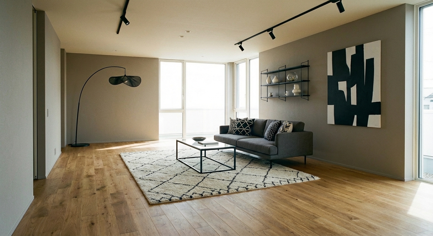
Mint green (#98FF98 to #AAF0D1 range in its purer forms, #B2DFDB to #A3D9C6 in muted versions) is green with a generous dose of white and a touch of blue. This combination gives it a freshness that deeper greens lack and a cheerfulness that sage or olive cannot match. Mint is inherently energizing but gentle — it does not have the intensity of emerald or the moodiness of forest green. The color works in rooms where you want to feel awake and refreshed: kitchens, bathrooms, home offices, and breakfast nooks. Its brightness makes it particularly effective in rooms with good natural light, where it reflects the green of outdoor foliage and amplifies the connection to nature.
How to Achieve This Look
Mint works best as a supporting color rather than the primary palette. Use it at the 30% level — a mint accent wall, mint kitchen cabinets, mint bathroom tile, or mint upholstered chairs. Pair with white (50%) for a crisp, fresh feel and natural wood (20%) for warmth. For a monochromatic approach, layer multiple mint tones from pale (near-white) to saturated (near-teal) across walls, textiles, and accessories. Avoid pairing mint with too many warm colors — it is a cool-leaning green that works best with other cool tones (soft gray, white, pale blue) and natural materials. Metallic accents should be brass or gold, which add the warm contrast that prevents mint from feeling clinical.
Mint green shifts dramatically between natural and artificial light — it can look blue, green, or gray depending on conditions. Intero AI previews mint tones in your specific room lighting to ensure the color reads as the fresh green you intend.
"I redesigned my entire apartment before buying a single piece of furniture."
— Sarah M.
Frequently Asked Questions
Q1 Is mint green trendy or timeless?
Mint cycles in and out of peak popularity, but it has never fully gone out of style. Its freshness is inherently appealing. For longevity, use muted mint (gray-toned) rather than bright mint, and apply it in changeable elements (tile, paint, textiles) rather than permanent fixtures.
Q2 What colors pair best with mint green?
White and cream for freshness. Coral for a bold complementary pop. Blush pink for a soft, romantic combination. Navy for sophisticated contrast. Gold and brass for warm metallic energy. Avoid orange and red, which compete aggressively with mint cool tone.
Q3 Which rooms suit mint green best?
Kitchens (mint cabinets or backsplash), bathrooms (mint tile or painted vanity), and nurseries (fresh and gender-neutral) are the most natural fits. Living rooms and bedrooms work with muted mint as an accent wall or in textiles. Home offices benefit from mint energizing-yet-calming quality.
Related searches
These are the next pages people usually open while narrowing this design direction.
You Might Also Like
Ready to Transform Your Room?
Download Intero and see this design in your space in seconds.
No credit card. No signup. Just results.