The Complete Guide to Monochromatic Interior Design
One color family. Infinite depth. Monochromatic design proves that you do not need a rainbow to create a rich, layered room — just mastery of tone and texture.
What is Complete Guide to Monochromatic Interior Design?
One color family. Infinite depth. Monochromatic design proves that you do not need a rainbow to create a rich, layered room — just mastery of tone and texture.
See the Transformation

Upload your room photo in the app to see your real transformation
Why It Works
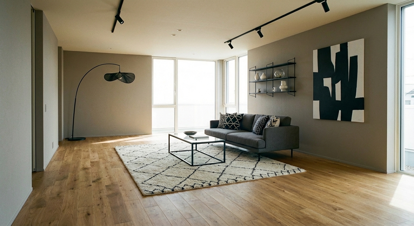
Monochromatic design uses a single color family across an entire room, varying only in shade (light to dark), tone (muted to saturated), and texture (matte to glossy). The approach succeeds because the unified color field creates an immersive, calming environment — the eye is not jumping between competing hues. Instead, it notices the subtle variations: the difference between a cream wall and an ivory sofa, between a camel cushion and a cognac leather chair. These quiet shifts create a sophisticated depth that multicolor palettes cannot achieve. Monochromatic rooms feel both calm and rich — the visual equivalent of listening to variations on a musical theme.
How to Achieve This Look
Choose one color family: warm neutrals (cream to chocolate), blues (ice to navy), greens (mint to forest), or grays (silver to charcoal). Select five to seven values within that family, from very light to very dark. Assign the lightest values to the largest surfaces (walls, ceiling) and progressively darker values to smaller elements (sofa, rug, accent chair, cushions, accessories). The critical ingredient is texture variation — without it, a monochromatic room is flat and boring. Layer different textures in the same color: velvet on the sofa, linen on curtains, wool on the rug, leather on an accent chair, ceramic on the coffee table, and matte paint on walls. Each material absorbs and reflects light differently, creating visual movement within the single-color field.
Monochromatic success depends on subtle tonal differences that are hard to judge from swatches alone. Intero AI previews how five to seven tones within your chosen color family create depth and layering in your specific room and lighting conditions.
Frequently Asked Questions
Q1 Will a monochromatic room feel boring?
Only if it lacks texture. A monochromatic room where every surface is the same smooth material feels flat. The same room with velvet, linen, leather, ceramic, and wood — all in the same color family — feels rich, sophisticated, and endlessly interesting. Texture is the secret to monochromatic success.
Q2 What is the easiest monochromatic palette?
Warm neutrals (cream to chocolate) are the most forgiving because they are inherently warm and welcoming. Every warm neutral — cream, beige, camel, tan, cognac, chocolate — works together naturally. You probably already own furniture and textiles in this family.
Q3 Can I add a single accent color to a monochromatic room?
Yes — one carefully placed accent color in a very small dose (a single vase, one throw pillow) can energize a monochromatic room without breaking the tonal scheme. Black works as a universal accent in any monochromatic room, adding graphic punch without introducing a competing hue.
Q4 How do I transition between a monochromatic room and the rest of my home?
Choose a monochromatic palette that shares at least one tone with adjacent rooms. An all-cream living room flows naturally into a kitchen with cream walls and wood cabinets. The monochromatic room should feel like an intentional calm zone, not a disconnected afterthought.
Related searches
These are the next pages people usually open while narrowing this design direction.
You Might Also Like
Ready to Transform Your Room?
Download Intero and see this design in your space in seconds.
No credit card. No signup. Just results.
Scan to download
Point your phone camera at a code

