Monochromatic vs Scandinavian — Tonal Sophistication or Nordic Light?
Both favor restraint and simplicity, but monochromatic design builds depth through tonal variation while Scandinavian design builds warmth through bright, functional simplicity.
What is Monochromatic vs Scandinavian: Tonal Depth vs Bright Simplicity?
Both favor restraint and simplicity, but monochromatic design builds depth through tonal variation while Scandinavian design builds warmth through bright, functional simplicity.
See the Transformation

Upload your room photo in the app to see your real transformation
Why It Works
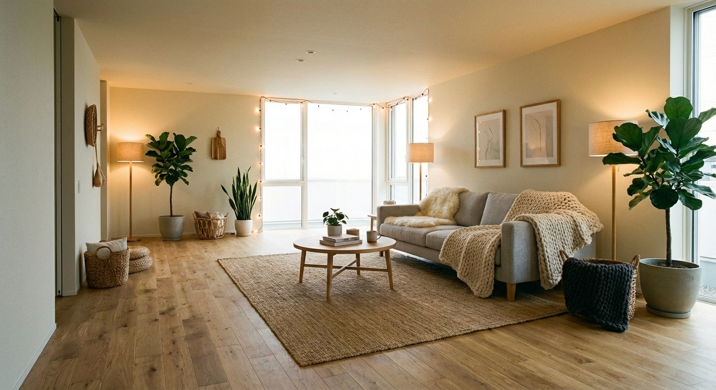
Monochromatic design uses a single color family across the entire room, varying in shade, tone, and texture. An all-beige room with cream walls, camel sofa, sand rug, and cognac leather accents is monochromatic — different values of the same warm neutral creating depth through subtle variation. Scandinavian design uses a bright, high-contrast palette — predominantly white with natural wood accents, black or gray contrast elements, and pops of muted color. Monochromatic builds sophistication through tonal subtlety; Scandinavian builds freshness through light maximization. Both are calm and edited, but monochromatic is a whisper while Scandinavian is a bright greeting.
How to Achieve This Look
For monochromatic: choose one color family (warm neutrals, blues, greens, or grays). Select three to five values from light to dark within that family. Assign the lightest values to the largest surfaces (walls, sofa) and the darkest to small accents (throw pillows, art, vessels). Create interest through texture variation — velvet, linen, wool, leather, and ceramic in the same color family. For Scandinavian: paint walls bright white, use light oak or birch wood for flooring and furniture, add one or two muted accent colors (soft pink, pale blue, sage), and keep styling minimal. Prioritize natural light and functional beauty — every item should serve a purpose.
Intero AI lets you preview both monochromatic tonal layering and Scandinavian bright simplicity in your room. Compare how an all-tone room creates depth through subtle variation versus how a white-and-wood room creates energy through light and contrast.
Frequently Asked Questions
Q1 Is monochromatic design boring?
Only when it lacks texture variation. A monochromatic room with uniform smooth surfaces is flat and dull. The same room with velvet, linen, boucle, leather, and ceramic — all in the same color family — is rich, sophisticated, and endlessly interesting. Texture is the secret ingredient.
Q2 Which makes a room feel larger?
Scandinavian, because of the bright white base and emphasis on natural light. Monochromatic rooms in light tones feel spacious, but monochromatic rooms in dark tones (all-navy, all-charcoal) create intimacy rather than expansion. For small rooms seeking spaciousness, Scandinavian wins.
Q3 Can I add color to a Scandinavian room?
Yes, but in measured doses. A muted blush pillow, a sage throw, or a single piece of blue pottery adds personality without disrupting the Scandinavian calm. Avoid saturated or neon colors, which clash with the soft, natural Scandinavian palette.
Related searches
These are the next pages people usually open while narrowing this design direction.
You Might Also Like
Design Guides You'll Love
Ready to Transform Your Room?
Download Intero and see this design in your space in seconds.
No credit card. No signup. Just results.
Scan to download
Point your phone camera at a code

