Sand & Stone — Desert Calm in Every Room
Inspired by arid landscapes and ancient architecture, this palette of sandy beiges and stone grays creates rooms with the timeless serenity of a desert at dawn.
What is Sand & Stone Color Palette for Interiors?
Inspired by arid landscapes and ancient architecture, this palette of sandy beiges and stone grays creates rooms with the timeless serenity of a desert at dawn.
See the Transformation
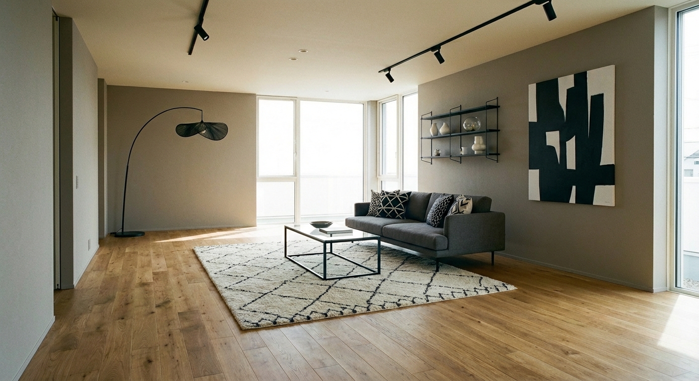

Upload your room photo in the app to see your real transformation
Why It Works
The sand-and-stone palette draws from one of the most calming natural environments: the desert. Warm sand tones (#C2B280 to #D2B48C range) evoke warmth without intensity. Cool stone tones (#8B8589 to #A09E9C range) provide grounding weight without coldness. Together, they create an environment of warm neutrality — rooms that feel serene, grounded, and timeless. The palette is inherently versatile because sand and stone are nature baseline colors — they accommodate any accent color, any furniture style, and any level of minimalism or layering. This makes the sand-and-stone palette the safest bet for anyone who wants a warm, sophisticated room without committing to a specific style direction.
Best for
- people ready to test options on a real photo before buying
- anyone planning a real living room where conversation distance, TV glare, and traffic past the sofa matter more than Pinterest perfection
- projects already thinking about linen, sofa, rug and needing a coherent layout
Skip if
- you will not address conversation distance and only want a filter look
- you refuse to remove anything and only add decor
Common mistakes
In a living room, “sand” fails when you shopping object-by-object with no envelope decision. Details like linen, sofa, rug only work if the plan respects conversation distance, TV glare, and traffic past the sofa. Another miss: pushing every seat against the walls and calling the empty middle “open”.
Decide this first
fix the primary seating pair and one clear path before decorative chairs. Lock a coherent material story instead of random catalog picks as a short list, then use Intero on a real photo so scale and light are honest before you spend.
How to Achieve This Look
Use warm sand tones on walls and large surfaces (60%) — colors like Benjamin Moore Sand Dune, Sherwin-Williams Accessible Beige, or similar warm beige-tans. Introduce stone tones (30%) through flooring, large textiles, or accent furniture — warm grays with taupe or brown undertones. Use white or cream (10%) for brightening accents. Layer extensively through texture: a linen sofa in sand, a wool rug in stone, cotton curtains in cream, and ceramic vessels in terracotta. The palette is flat without texture — rough stone, smooth linen, nubby wool, and matte clay provide the visual interest that color variety would normally supply. Add natural elements: dried grasses, stone objects, and raw wood.
Neutral palettes live or die by texture and tone — the difference between "sophisticated desert calm" and "boring beige room" is entirely in the execution. Intero AI previews how different sand and stone tones, material textures, and natural accents create depth in your specific room.
Frequently Asked Questions
Q1 How do I prevent a sand-and-stone room from looking boring?
Texture is everything. A room with sand walls, a sand sofa, and a sand rug in the same smooth material is boring. The same room with a limewash sand wall, a linen sand sofa, a wool stone rug, and a ceramic terracotta vase is rich and layered. Vary the material of every surface.
Q2 What accent colors work with sand and stone?
Terracotta, rust, sage green, and warm charcoal add depth while staying within the natural-landscape family. Black provides drama as a small accent. Avoid cool blues and bright colors, which clash with the warm desert foundation. The best accents feel like they could exist in the same landscape.
Q3 Which design styles pair best with this palette?
Mediterranean, japandi, organic modern, and wabi-sabi all thrive in sand and stone tones. The palette also supports minimalist, contemporary, and transitional styles. Its neutrality makes it style-agnostic — the furniture silhouettes and accessories determine the style, not the colors.
Related searches
These are the next pages people usually open while narrowing this design direction.
You Might Also Like
Ready to See This Style in Your Room?
Download Intero and preview this design on your own room photo.
No credit card. No signup. Just results.
Scan to download
Point your phone camera at a code

