Olive Green — The Earthy, Muted Green for Grounded Living
Neither forest nor sage, olive green carries the warmth of amber mixed with the calm of nature. It is the most livable green — sophisticated, warm, and endlessly pairable.
What is Olive Green Color Palette for Interiors?
Neither forest nor sage, olive green carries the warmth of amber mixed with the calm of nature. It is the most livable green — sophisticated, warm, and endlessly pairable.
See the Transformation
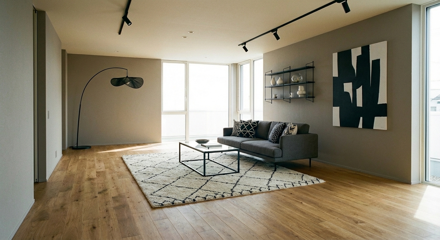

Upload your room photo in the app to see your real transformation
Why It Works
Olive green (#556B2F to #808000 range) is a yellow-based green — warmer and earthier than sage (gray-based) and softer than forest green (blue-based). This warm undertone gives olive a unique quality: it reads as both organic and warm, combining the calming properties of green with the comforting warmth of yellow and brown. The color has a long history in Mediterranean, military, and mid-century design, giving it a range of associations from Tuscan olive groves to 1960s Danish furniture showrooms. Olive green works as both a neutral and an accent — light olive can serve as a wall color that functions almost like a warm gray, while deeper olive makes a rich accent that pairs with virtually any warm palette.
Best for
- people ready to test options on a real photo before buying
- anyone planning a real living room where conversation distance, TV glare, and traffic past the sofa matter more than Pinterest perfection
- projects already thinking about sofa, curtains, rug and needing a coherent layout
Skip if
- you will not address conversation distance and only want a filter look
- you need the room finished tomorrow with zero test fits
Common mistakes
In a living room, “olive” fails when you shopping object-by-object with no envelope decision. Details like sofa, curtains, rug only work if the plan respects conversation distance, TV glare, and traffic past the sofa. Another miss: pushing every seat against the walls and calling the empty middle “open”.
Decide this first
fix the primary seating pair and one clear path before decorative chairs. Lock a coherent material story instead of random catalog picks as a short list, then use Intero on a real photo so scale and light are honest before you spend.
How to Achieve This Look
For walls: choose a lighter olive (sometimes called "artichoke" or "sage olive") that reads as a warm neutral rather than a bold color. This creates a nature-inspired backdrop without the statement intensity of darker greens. For accents: deeper olive on a sofa, curtains, or a rug adds richness. Pair olive with warm neutrals: cream, beige, camel, and warm brown. The palette comes alive with natural materials — linen, jute, raw wood, and terracotta. Gold and brass metallics amplify the warm undertones. Supporting accent colors include rust, terracotta, cream, and warm charcoal. Avoid cool blues and purples, which can make olive look muddy.
Olive green varies enormously — some versions lean yellow-green, others brown-green. The wrong shade can look muddy or military rather than sophisticated. Intero AI lets you preview different olive tones in your room to find the version that reads as warm and earthy rather than drab.
Frequently Asked Questions
Q1 How is olive green different from sage?
Sage is a gray-based muted green — cool, soft, and delicate. Olive is a yellow-brown-based green — warm, earthy, and substantial. Sage reads as modern and calming; olive reads as earthy and grounded. In a room, sage feels like morning fog; olive feels like an autumn hillside.
Q2 Is olive green trendy or timeless?
Olive is one of the most timeless greens available. It has been used in interiors for centuries across many cultures and never fully goes out of style because it references the natural world so directly. It may not appear on annual trend lists, but it never appears on "going out of style" lists either.
Q3 What wood tones pair best with olive green?
Warm, medium-toned woods are ideal — walnut, warm oak, and teak. Light woods (birch, maple) can work but create less visual impact. Very dark woods (espresso, ebony) can make olive look drab by absorbing its warmth. The sweet spot is a rich, warm wood that echoes olive warm undertones.
Related searches
These are the next pages people usually open while narrowing this design direction.
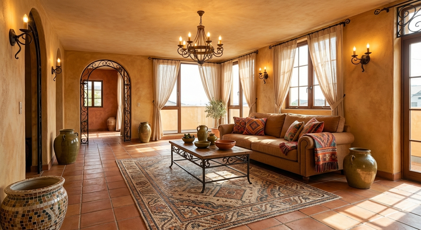
Ready to See This Style in Your Room?
Download Intero and preview this design on your own room photo.
No credit card. No signup. Just results.
Scan to download
Point your phone camera at a code

