Sunset Warm — Golden Hour Captured in a Color Palette
Amber, peach, soft gold, and warm clay — the sunset palette recreates the most beautiful light of the day as a permanent design feature.
What is Sunset Warm Color Palette for Interiors?
Amber, peach, soft gold, and warm clay — the sunset palette recreates the most beautiful light of the day as a permanent design feature.
See the Transformation
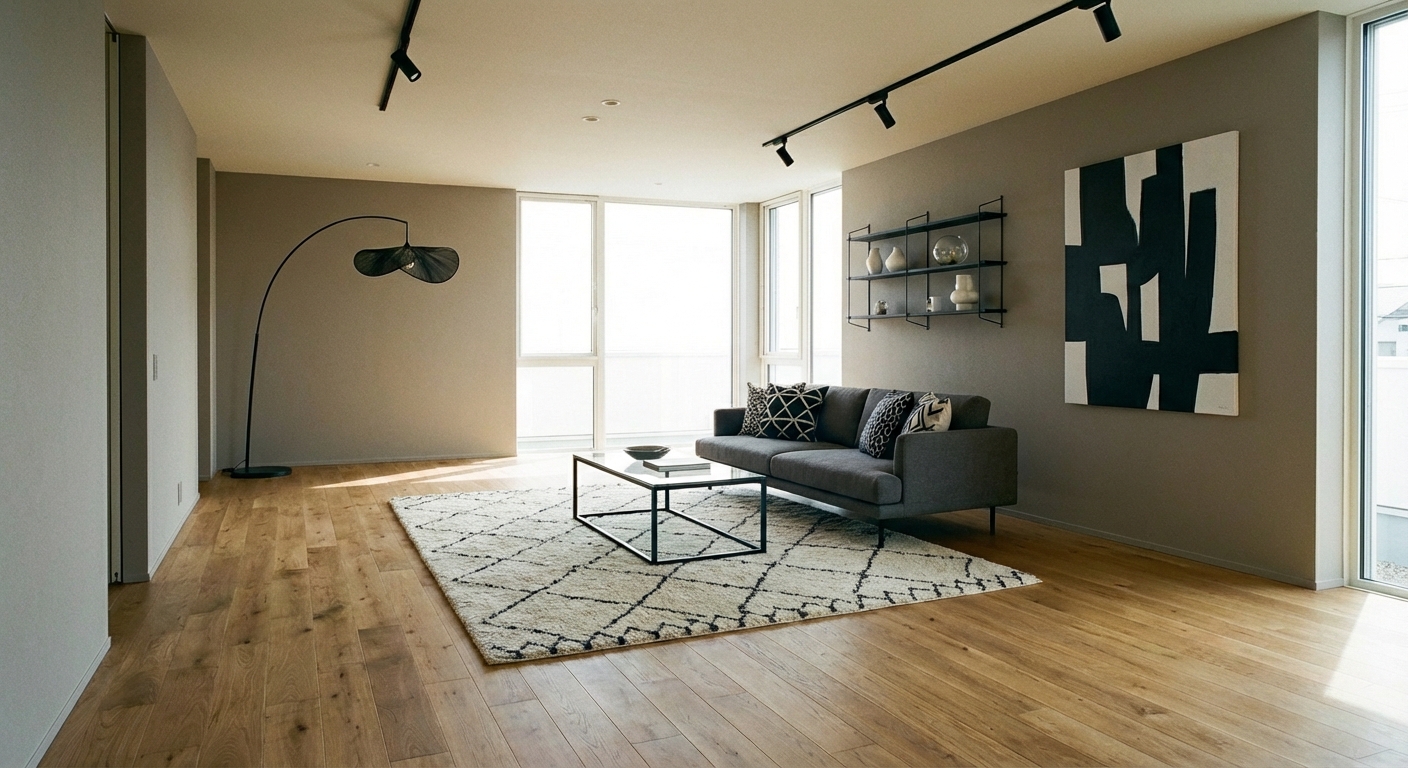

Upload your room photo in the app to see your real transformation
Why It Works
The sunset palette draws from the colors of golden hour — the warm amber, soft peach, dusty gold, and warm clay tones that fill a room when the sun sits low on the horizon. These colors are universally flattering: interior designers and photographers both know that warm golden light makes everything (and everyone) look better. The palette works because it replicates this effect permanently. Rooms designed in sunset tones glow even on overcast days and in artificial light. The colors sit in the warm segment of the color wheel — peach (#FFCBA4), amber (#FFBF00 to #D4A017), warm clay (#C77B55), and soft gold (#D4B996) — creating a harmonious analogous scheme that feels cohesive and enveloping without any jarring contrasts.
How to Achieve This Look
Build from light to deep: the palest peach or warm cream on walls, medium amber and gold tones in textiles and furniture, and deeper clay and warm brown in grounding elements like rugs and accent pieces. The palette is inherently analogous (adjacent on the color wheel), so you can use multiple tones simultaneously without color clash. Materials should be warm and tactile: linen in peach, velvet in amber, leather in caramel, and pottery in warm clay. Natural wood in honey or medium oak tones extends the warmth. Brass and gold metallics feel like a natural extension of the palette. For contrast, use warm charcoal or deep chocolate brown rather than black, which would feel too harsh against these soft warm tones.
The sunset palette requires careful tone coordination — too much peach can feel nursery-like, too much amber can feel dated. Intero AI lets you layer sunset tones in your room gradually, finding the exact combination of peach, amber, and gold that creates a warm glow rather than a color overwhelm.
"Saved thousands on interior design fees. The AI suggestions were spot-on."
— James R.
Frequently Asked Questions
Q1 Will a sunset palette make my room feel too warm?
In rooms with generous natural light or south-facing windows, the warmth can intensify. Balance with white or cream as breathing room and avoid saturating all surfaces. In cooler, north-facing rooms, sunset tones are ideal — they add the warmth that the natural light lacks.
Q2 How do I add sunset tones without repainting?
Start with textiles: amber and peach cushions, a warm clay throw, and gold-toned accessories. Replace cool-toned lampshades with warm cream or amber versions. Swap chrome hardware for brass. These changes shift the room temperature toward sunset without touching a paint brush.
Q3 What design styles work with sunset tones?
Mediterranean, bohemian, and mid-century modern all naturally embrace this warm palette. Contemporary spaces benefit from sunset accents against a neutral base. Japandi can incorporate muted sunset tones through ceramics and textiles. The palette is versatile enough for any style that welcomes warmth.
Related searches
These are the next pages people usually open while narrowing this design direction.
You Might Also Like
Ready to Transform Your Room?
Download Intero and see this design in your space in seconds.
No credit card. No signup. Just results.